Tour de France 2026 Twitter infographic planning starts with one decision – what you want the graphic to prove, and what you will do if the numbers move. If you are a brand, team, creator, or agency, the goal is not a pretty recap. Instead, you want a single-page view of attention, sentiment, and creator impact that can guide spend, content, and partnerships during the race. This guide breaks down the metrics that matter on X (still widely called Twitter), the definitions you need to avoid reporting mistakes, and a step-by-step workflow to build an infographic that stakeholders actually use. Along the way, you will get formulas, example calculations, and two tables you can copy into your own reporting deck.
Tour de France 2026 Twitter infographic: define the job-to-be-done
Before you touch a chart, write a one-sentence brief for the infographic. For example: “Show how our riders and sponsors drove incremental reach and positive sentiment on race days, and which creators amplified the message most efficiently.” That sentence forces you to choose metrics that connect to action, not vanity. Next, decide your audience: executives want a top-line story, while social managers need a tactical view by stage and format. Finally, set a time window that matches decision cycles – daily during the race, then a weekly rollup, then a post-race summary.
Takeaway checklist:
- Pick one primary outcome: awareness, engagement, traffic, or conversions.
- Choose a reporting cadence: daily, stage-based, weekly, post-race.
- Define the comparison baseline: last year, pre-race period, or competitor set.
- Write 3 questions the infographic must answer (for example, “Which stage generated the biggest lift?”).
Key terms you must define (so your numbers are defensible)
Infographics fail when teams mix terms that sound similar but measure different things. Define these early in your document so anyone reading the graphic understands what is being counted. Reach is the estimated number of unique accounts that saw content, while impressions are total views including repeats. Engagement rate is engagements divided by impressions or reach – you must state which denominator you used. CPM is cost per thousand impressions, CPV is cost per view (often used for video), and CPA is cost per acquisition (a purchase, signup, or other conversion).
On the partnership side, whitelisting means a brand runs paid ads through a creator’s handle, which changes how you evaluate performance because paid distribution is involved. Usage rights define where and how long the brand can reuse creator content (for example, organic social only for 3 months). Exclusivity restricts a creator from working with competitors for a period, which affects pricing and should be called out in your cost notes. If you want a deeper library of influencer reporting and measurement concepts, keep a tab open to the InfluencerDB.net blog resources and link the relevant explainer in your internal deck.
Takeaway checklist:
- Write your engagement rate formula directly under the chart title.
- Separate organic results from whitelisted paid results in every table.
- Document usage rights and exclusivity next to costs so CPM comparisons stay fair.
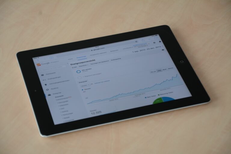
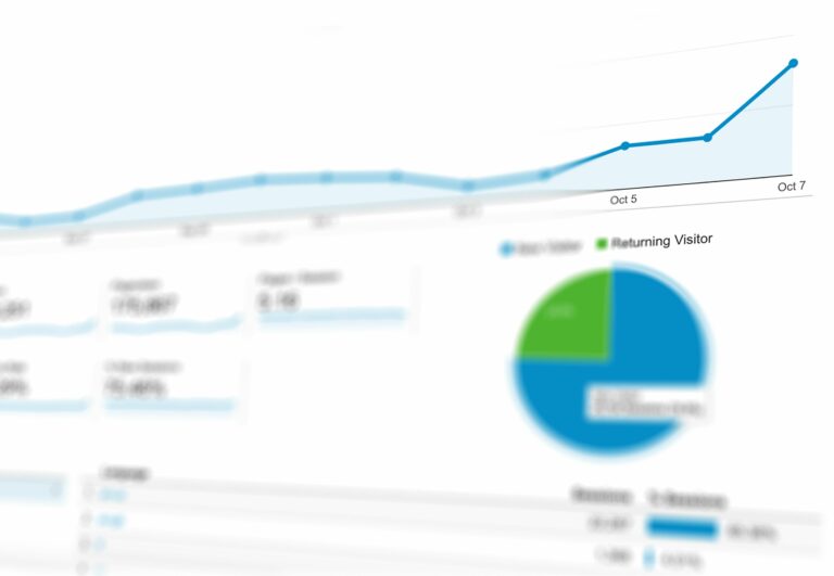
What to measure on X during the Tour: a practical metric stack
A strong Tour-focused Twitter infographic usually needs three layers: volume, quality, and impact. Volume tells you how much conversation exists (posts, mentions, hashtag usage). Quality tells you whether the conversation is favorable and whether it is driven by credible accounts (sentiment, share of voice, creator quality). Impact ties the conversation to your objectives (link clicks, video views, conversions, follower growth). Importantly, you do not need every metric – you need the smallest set that answers your three questions.
For Tour de France coverage, stage-by-stage context matters. A mountain stage can spike conversation even if your brand did nothing, so include a “race context” annotation layer: breakaways, crashes, jersey changes, and key rival moments. That lets you explain why a metric moved and whether your content contributed. Also, separate “official” accounts (teams, riders, race organizers) from “media and creators” because their posting behavior and audience expectations differ.
| Infographic section | Metric | Why it matters | Decision it supports |
|---|---|---|---|
| Conversation | Mentions and hashtag volume | Shows attention peaks by stage and moment | When to post and which moments to react to |
| Share of voice | % of mentions vs competitor set | Normalizes performance in a noisy event | Whether your messaging is breaking through |
| Engagement | Engagement rate (define denominator) | Quality signal beyond raw likes | Which formats and angles to repeat |
| Video | Views, completion rate, CPV (if paid) | Shows creative resonance | Which clips to boost or repurpose |
| Traffic | Link clicks and CTR | Connects social to site behavior | Landing page and offer optimization |
| Creator impact | Incremental reach and CPM by creator | Compares partners on efficiency | Who to renew, upsell, or drop |
Takeaway: If you can only include five charts, make them: mentions over time, share of voice, engagement rate by content type, top creators by efficient reach (CPM), and a stage timeline with annotated moments.
Formulas and example calculations (so your infographic is not hand-wavy)
Numbers become useful when you show how they were computed. Keep formulas simple and consistent across the race. Here are the core calculations that work well for Tour reporting on X, whether you are summarizing organic posts or influencer activations. When you use paid amplification, label it clearly and calculate paid metrics separately, then provide a blended view only if stakeholders ask for it.
- Engagement rate (impressions-based) = total engagements / total impressions
- CPM = cost / (impressions / 1000)
- CPV = cost / video views
- CPA = cost / acquisitions
- Share of voice = your mentions / total mentions in the set
Example: you pay a cycling creator $2,000 for a thread and a short video. The posts generate 180,000 impressions and 9,000 total engagements. Engagement rate (impressions-based) = 9,000 / 180,000 = 5%. CPM = 2,000 / (180,000 / 1,000) = 2,000 / 180 = $11.11. If the video gets 60,000 views, CPV = 2,000 / 60,000 = $0.033. If you track 40 newsletter signups from tagged links, CPA = 2,000 / 40 = $50. Those four numbers tell a clear story: strong engagement, efficient reach, and a conversion cost you can compare to other channels.
For link tracking, use tagged URLs and a consistent naming system. Google’s official UTM guidance is a solid reference for building tags that stay readable across teams: Campaign URL builder and UTM parameters. Put your UTM convention in a small note inside the infographic or in the appendix of your deck so analysts can replicate it.
Takeaway checklist:
- Pick one engagement rate definition and stick to it for the entire race.
- Always show CPM for creators if you are comparing partners.
- Use UTMs for every link and store the naming convention in one shared doc.
Build the infographic in 7 steps (workflow you can run daily)
A repeatable workflow keeps your Tour reporting fast and consistent. Start by locking your data sources, then automate what you can, and finally reserve human time for interpretation. Because the Tour moves quickly, you want a process that can be completed in under 60 minutes per day once the template is built. The steps below assume you are pulling platform analytics, social listening, and creator reporting into one view.
- Set the scope: list official hashtags, team and rider handles, sponsor handles, and a competitor set.
- Collect data: export post-level metrics (impressions, engagements, video views), plus mention volume and sentiment if you have listening.
- Clean and label: tag each post by stage, format (video, image, thread), and theme (recap, behind-the-scenes, product).
- Compute KPIs: calculate engagement rate, CPM, CPV, and share of voice using the same formulas daily.
- Pick the story: choose 3 insights max for the day (for example, “breakaway clip drove 2x completion rate”).
- Design the layout: keep a fixed grid so only the numbers change, not the structure.
- Publish and archive: save a dated version and a data snapshot so you can audit later.
| Phase | Tasks | Owner | Deliverable |
|---|---|---|---|
| Pre-race | Define hashtags, competitor set, UTM rules, creator list | Analyst + Social lead | Measurement plan and template |
| Daily (race) | Export metrics, tag posts, compute KPIs, select 3 insights | Analyst | Daily infographic draft |
| Daily (approval) | Check claims, confirm costs, validate links and UTMs | Marketing manager | Approved infographic |
| Weekly | Roll up by stage type, identify top creators, recommend shifts | Analyst + Partnerships | Weekly performance memo |
| Post-race | Finalize totals, compare to baseline, document learnings | Analytics lead | Post-race report and next-year playbook |
Takeaway: Treat the infographic as a product. A stable template plus daily tagging is what makes your numbers comparable across 21 stages.
Creator and brand benchmarking for Tour content (what “good” looks like)
Benchmarks keep stakeholders from overreacting to a single viral post. For Tour content, performance varies by stage drama, time zone, and the size of the account, so use ranges rather than single targets. Compare creators within similar follower tiers and content formats. Also, separate “event news” posts from “sponsor message” posts because their engagement patterns differ.
When you benchmark CPM and engagement rate, include notes about deliverables and rights. A creator who grants 6 months of paid usage rights and category exclusivity should not be judged purely on CPM. Likewise, a creator posting live from the route has higher production costs than someone reposting broadcast clips. If you need to explain these trade-offs to non-marketers, put a small “what was included” box next to the creator ranking.
Decision rule: If two creators deliver similar reach, favor the one with higher click intent (CTR) when your goal is traffic. If the goal is awareness, favor the one with lower CPM and strong brand-safe sentiment.
Common mistakes that make Tour infographics misleading
Most reporting errors come from mixing apples and oranges. One common mistake is blending paid and organic results without labeling them, which inflates impressions and hides creative weakness. Another is using engagement rate on a per-post basis for some charts and on a total basis for others, which changes the story. Teams also forget to normalize by posting volume, so an account that posts 40 times looks “bigger” than one that posts 5 high-performing updates.
Sentiment is another trap. Automated sentiment can misread sarcasm, slang, and multilingual posts that are common during the Tour. If sentiment is central to your infographic, sample and manually validate the top posts driving negative or positive swings. Finally, avoid cherry-picking screenshots of “best tweets” without showing the distribution. A single viral moment is interesting, but it should not dictate next week’s budget.
Takeaway checklist:
- Label paid vs organic everywhere, including in footnotes.
- Use one engagement rate definition across all visuals.
- Normalize by number of posts when comparing accounts.
- Manually review sentiment outliers before publishing.
Best practices: make the infographic useful for sponsors and stakeholders
To make the infographic travel well inside an organization, design it for scanning. Lead with a headline insight, then show the evidence, then end with an action. Keep the number of colors limited and reserve one color for your brand or team so the eye knows what to track. Add short annotations on the timeline to connect spikes to race moments, which prevents “why did this happen?” follow-ups.
For sponsor reporting, include a clear methodology note: what handles were included, what time zone you used, and how you treated retweets and quote posts. If you are reporting on creator partnerships, disclose whether whitelisting was used and what usage rights were included. For guidance on endorsements and disclosures when creators post sponsored content, reference the FTC’s official endorsement guides: FTC endorsements and influencer guidance. Even if your infographic is internal, compliance notes protect you when screenshots circulate.
Takeaway checklist:
- Structure each page as Insight – Evidence – Action.
- Add a small methodology box (scope, time zone, definitions).
- Document usage rights, exclusivity, and whitelisting for creator lines.
- Keep a running “what we changed” log so weekly rollups stay consistent.
A simple template you can copy for your next race-day post
If you want a fast starting point, use this one-page layout: top row with total mentions, share of voice, and engagement rate; middle row with a mentions timeline annotated by stage moments; bottom row with top 5 posts and top 5 creators ranked by CPM, plus one recommendation. That structure works because it balances context, performance, and action. It also scales: you can add a sponsor-specific panel without redesigning the entire page.
Once the template is stable, your main job becomes consistent tagging and honest interpretation. Over time, those daily snapshots become a dataset you can use to negotiate creator rates, plan content formats, and justify sponsorship renewals. If you want more measurement frameworks and reporting examples, browse additional guides in the and adapt the parts that match your KPIs.
Final takeaway: A Tour infographic is only as strong as its definitions, formulas, and decision rules. Build it like a tool, not a souvenir.