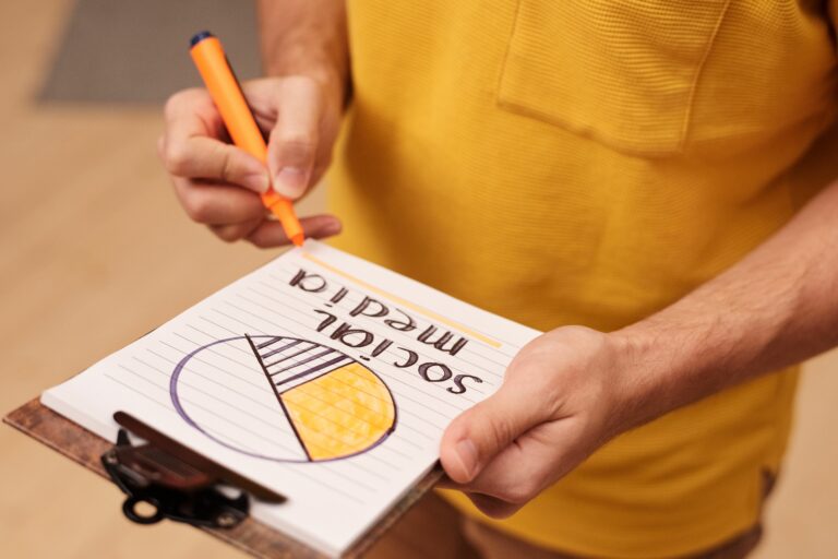
Social media graphic design trends are shifting fast in 2025, and the brands winning attention are the ones designing for clarity, speed, and measurable outcomes. The biggest change is not a new font or filter – it is a new standard for performance: graphics must communicate in under a second, survive compression, and still drive saves, shares, clicks, or watch time. In practice, that means tighter hierarchy, bolder typography, and layouts built for mobile-first scanning. Just as importantly, design is now tied to influencer deliverables, usage rights, and paid amplification, so your creative system has to work across organic and ads. This update breaks down what is trending, why it works, and how to apply it with decision rules you can use today.
Start with the metrics: design trends that map to reach and engagement
Before you chase a look, anchor your design choices to the metrics the platforms actually reward. Here are the key terms you should align on with your team or creator partners early. Reach is the number of unique accounts that saw the content, while impressions are total views including repeats. Engagement rate is typically engagements divided by reach or impressions (define which one you use), and it is most useful when you compare like-for-like formats. CPM is cost per thousand impressions, CPV is cost per view (often used for video), and CPA is cost per acquisition (a purchase, signup, or other conversion). Whitelisting means running ads through a creator’s handle, while usage rights define how and where you can reuse creative. Finally, exclusivity is a restriction that prevents a creator from working with competitors for a period of time, and it often changes pricing.
Design connects to these numbers more directly than many teams admit. For example, a carousel cover with a clear promise tends to lift saves and swipe-through rate, which can increase distribution and downstream reach. A short-form video with readable on-screen text improves completion rate, which is a common proxy for quality. As a result, the most useful “trend” is any repeatable design pattern that improves a measurable behavior.
- Decision rule: If your goal is reach, prioritize legibility and a single focal point. If your goal is clicks, prioritize a clear value proposition plus a visible CTA.
- Quick formula: Engagement rate (by reach) = total engagements / reach. If you use impressions instead, label it clearly in reporting.
- Practical tip: Track saves per 1,000 reach on carousels and shares per 1,000 reach on memes or templates. Those two signals often predict longer-tail distribution.
Social media graphic design trends for 2025: what you will see everywhere

The 2025 look is less about minimalism versus maximalism and more about structured boldness. Designers are using louder type, higher contrast, and more deliberate grids, but they are also simplifying the message. In other words, the feed is busy, so the winning graphics feel decisive. You will also notice more “editorial” layouts that borrow from magazines: strong headlines, subheads, and pull quotes that guide the eye. This works because it matches how people scan on mobile – top line, then supporting detail, then action.
Here are the trends that are performing across brands and creators, with a concrete way to apply each one:
- Big type, tight hierarchy: Use one dominant headline (6 to 10 words) and one supporting line (10 to 18 words). If you need more, move it to slide two.
- High-contrast palettes: Choose one background color and one accent color that passes basic contrast checks. If you cannot read it at arm’s length, it will not survive compression.
- Template-first carousels: Repeat the same grid across slides so the viewer knows what to expect. Consistency increases swipe-through.
- “Proof” overlays: Add a small badge for stats, ratings, or outcomes, such as “+32% CTR” or “5-step checklist.” Keep it in the same corner across posts.
- Purposeful texture: Grain, paper, and subtle noise are back, but only when they support brand tone. Avoid heavy effects that create banding after upload.
If you want a fast way to operationalize these patterns, build a mini style kit: 2 headline fonts, 2 body fonts, 6 brand colors, and 3 grid templates (single image, carousel, story). Then enforce it across brand and creator deliverables so your content looks coherent even when multiple people produce it.
Format-first design: carousels, short video, stories, and thumbnails
Design trends only matter when they fit the format. In 2025, the same message needs multiple executions: a carousel cover, a story frame, a short video intro card, and often a thumbnail for reposting to other platforms. The practical takeaway is to design a “core asset” and then adapt it, rather than reinventing every time. That reduces production time and keeps your visual language consistent.
Carousels: Treat slide one like a headline and slide two like the lede. Keep the cover promise specific: “3 mistakes killing your reach” beats “Social tips.” Use a progress cue such as “1/6” to reduce drop-off. Short-form video: Put the hook on screen in the first second, and keep captions large enough to read without squinting. Stories: Leave safe margins for UI elements and keep CTAs away from the bottom. Thumbnails: Use a single subject and 3 to 5 words max, because thumbnails are viewed small in grids.
For platform-specific guidance, it helps to follow official documentation so you do not design against the algorithm’s constraints. Meta’s guidance on ad creative specs is a useful baseline even for organic design because it reflects how content is rendered and compressed: Meta Business Help Center. Keep your internal checklist updated as specs change, especially if you repurpose influencer content into paid.
| Format | Design goal | What to optimize | Practical checklist |
|---|---|---|---|
| Carousel | Saves and swipe-through | Cover clarity, slide rhythm | 1 clear promise on slide 1; consistent grid; 1 idea per slide; recap on final slide |
| Short video | Completion rate | Hook readability, pacing | On-screen hook in 1s; captions at 48px+ equivalent; cut dead air; end with a single CTA |
| Stories | Clicks and replies | Tap behavior, CTA placement | Safe margins; high contrast CTA; 1 interaction sticker max; link sticker above the fold |
| Thumbnail | Grid click-through | Recognizability at small size | Single focal point; 3 to 5 words; avoid thin fonts; test at 10% zoom |
Influencer-ready design: briefs, usage rights, whitelisting, and exclusivity
In influencer marketing, design is not just aesthetics – it is a deliverable that affects pricing and performance. If you plan to repurpose creator graphics for ads, you need to specify usage rights (where, how long, and in what media) and whether you will use whitelisting to run paid through the creator’s handle. Those choices change what “good design” means, because ad-safe creative needs clearer branding, fewer copyrighted elements, and more consistent CTAs.
Here is a brief framework you can copy into your next creator brief. First, define the objective (reach, clicks, sales) and the primary metric (reach, CTR, CPA). Next, define the format mix (1 Reel + 1 story set + 1 carousel, for example). Then, specify design constraints: brand colors, do-not-use fonts, logo placement rules, and caption requirements. Finally, clarify rights: 30-day paid usage, whitelisting allowed, and category exclusivity for 14 days, for instance. If you want a deeper library of planning and execution guidance, keep a running set of templates in your team wiki and cross-check with the resources on the InfluencerDB Blog as you refine your process.
| Brief element | What to include | Why it matters | Example line you can paste |
|---|---|---|---|
| Objective and KPI | Primary metric and target | Aligns design to outcome | Goal: saves; KPI: 25 saves per 1,000 reach on carousel |
| Deliverables | Formats, count, deadlines | Prevents scope creep | 1 carousel (6 slides) + 3 story frames + raw files due in 7 days |
| Usage rights | Channels and duration | Determines what you can reuse | Paid + organic usage on IG and TikTok for 60 days, worldwide |
| Whitelisting | Yes/no and access method | Unlocks creator-handle ads | Whitelisting approved via platform authorization for 30 days |
| Exclusivity | Category and time window | Impacts creator pricing | No competing skincare sponsors for 14 days after posting |
A simple measurement framework: connect design choices to CPM, CPV, and CPA
Once you treat design as a variable you can test, you can measure it like any other performance lever. Start by defining which costs you are tracking. CPM = (spend / impressions) x 1,000. CPV = spend / views (define view as 2-second, 3-second, or platform default). CPA = spend / conversions. Then add a creative diagnostic layer: hook rate, hold rate, and action rate. Hook rate can be 3-second views divided by impressions, hold rate can be average watch time divided by video length, and action rate can be clicks divided by reach.
Here is a quick example you can run in a spreadsheet. Suppose you spend $600 boosting a creator video. It gets 120,000 impressions and 30,000 views (platform-defined), plus 240 purchases. Your CPM is (600/120,000) x 1,000 = $5. Your CPV is 600/30,000 = $0.02. Your CPA is 600/240 = $2.50. If the CPA is strong but the CPM is rising, your targeting may be narrowing. If CPM is stable but CPA worsens, your design and message may be attracting the wrong audience or failing to convert.
When you run paid or whitelisted content, follow platform measurement standards so your comparisons stay clean. Google’s overview of conversion measurement concepts is a solid reference point for teams that mix organic and paid reporting: Google Ads conversion tracking. Keep external references like this in your reporting doc so stakeholders understand how numbers are defined.
- Test plan: Change one design variable at a time (headline length, background contrast, CTA placement) and keep the offer constant.
- Minimum sample rule: Do not call a winner until each variant has at least 5,000 to 10,000 impressions, or your result will be noise.
- Creative learning: Log what changed and what moved (for example, higher contrast improved hook rate but reduced comments).
Tool stack for 2025: faster production without losing brand control
Teams are producing more assets than ever, so the trend is toward tools that reduce friction: shared templates, brand kits, and quick resizing across formats. However, speed only helps if it does not dilute consistency. The practical approach is to standardize your system: one place for templates, one place for approved fonts and colors, and one naming convention for exports. That way, creators and internal designers can collaborate without endless revisions.
When you evaluate tools, score them against your workflow. Do you need collaborative editing, version history, and brand controls? Do you need motion templates for short video? Do you need export presets that match your platform mix? Below is a comparison table you can use to decide quickly.
| Tool type | Best for | Strength | Watch-outs | Ideal user |
|---|---|---|---|---|
| Template-based design app | Fast social production | Speed, collaboration, brand kits | Can look generic without custom typography | Social managers and creators |
| Pro design suite | High-control brand systems | Precision, advanced layout | Slower for non-designers | Design teams |
| Motion editor | Short video graphics | Captions, kinetic type, transitions | Easy to overdo effects | Video editors |
| Digital asset manager | Scaling across teams | Search, rights tracking, approvals | Requires disciplined tagging | Brand ops and agencies |
- Takeaway: If you work with influencers, require editable source files only when you have usage rights and a real need to localize or resize.
- Process tip: Create export presets named by platform and placement (IG Reel cover, TikTok thumbnail, Story frame) to reduce mistakes.
Common mistakes (and how to fix them fast)
Most underperforming social graphics fail for predictable reasons. The first is trying to say too much on the first frame, which kills comprehension and reduces swipe-through or watch time. Another common issue is low contrast text over busy imagery, which looks fine on a desktop preview but collapses on mobile. Teams also forget that compression changes colors and softens thin fonts, so delicate design choices often disappear after upload. Finally, many brands treat influencer content as “done” once posted, even though the same asset could be optimized for paid with small tweaks.
- Mistake: Headline is vague. Fix: Add a specific promise, number, or audience cue (for example, “for new creators”).
- Mistake: Too many fonts. Fix: Limit to two, and use weight and size for variety instead of new typefaces.
- Mistake: No CTA. Fix: Add one action per post: save, share, comment, click, or watch next.
- Mistake: Unclear rights. Fix: Put usage rights, whitelisting, and exclusivity in writing before production starts.
Best practices: a repeatable checklist for creators and brands
Trends come and go, but a strong workflow keeps you competitive. In 2025, the best teams treat design as a system: they plan, produce, test, and iterate. They also document what works so new creators or freelancers can match the house style quickly. If you want your graphics to perform across organic and paid, you need both creative taste and operational discipline.
- Define success: Pick one primary KPI per post type (saves for carousels, completion rate for video, clicks for stories).
- Design for the first second: Make the hook readable at a glance, and keep the message above the fold.
- Build modular templates: One grid, multiple topics. This speeds production and improves recognition.
- Test with intent: Run A/B variants on a single variable, then log the result in a simple creative library.
- Protect compliance: If a post is sponsored, ensure disclosure is visible and unambiguous. The FTC’s guidance is the baseline reference: FTC endorsement guides.
To make this operational, end each month with a short creative review. Pull your top 10 posts by KPI, screenshot them, and annotate what worked: headline structure, color contrast, layout, and CTA. Then update your templates so next month’s “trend” is not guesswork – it is a documented advantage.