
Mobile landing page performance is often the difference between a profitable influencer campaign and a leaky funnel that burns budget. Most traffic from creators now arrives on a phone, in-app, and with low patience for slow loads or confusing layouts. That means your page has one job: help a mobile visitor understand the offer, trust it, and take the next step in seconds. In practice, conversion comes from a chain of small wins – speed, clarity, relevance, and measurement – not a single “hack.” This guide breaks the process into decisions you can make quickly, with checklists, formulas, and examples you can copy.
What “conversion” means on a mobile landing page
Before you design anything, define what “converts” means for your campaign. A conversion can be a purchase, an email signup, an app install, a quiz completion, or even a click to a retailer. On mobile, micro-conversions matter because they reduce friction and build momentum toward the primary action. For influencer traffic, you also need to separate “interest” from “intent,” since many visitors arrive curious rather than ready to buy. Your landing page should make the next step feel easy, not final.
Set one primary conversion and up to two secondary conversions. Then decide what success looks like in numbers. A simple way is to set a target conversion rate (CVR) and a target cost per acquisition (CPA) based on your economics. If you do not know your baseline, start with a short test and use the results to set realistic goals.
- Primary conversion: the main action you optimize for (purchase, lead, install).
- Secondary conversion: supporting action (email capture, SMS opt-in, add to cart).
- Decision rule: if a design choice improves the primary conversion but hurts revenue per visitor, you may still lose money – track both.
Key terms you should define before you build
Mobile landing pages sit inside a bigger influencer and paid social measurement stack, so align on terms early. Otherwise, teams argue about performance while looking at different numbers. Use the definitions below in your brief and reporting so creators, agencies, and internal stakeholders speak the same language.
- Reach: unique people who saw the content.
- Impressions: total views, including repeats.
- Engagement rate: engagements divided by reach or impressions (you must specify which). Example: ER by reach = (likes + comments + saves) / reach.
- CPM: cost per 1,000 impressions. Formula: CPM = (spend / impressions) x 1000.
- CPV: cost per view, common for video. Formula: CPV = spend / views.
- CPA: cost per acquisition (your conversion). Formula: CPA = spend / conversions.
- Whitelisting: running ads through a creator’s handle (also called creator licensing in some tools). It can improve performance because the ad looks native.
- Usage rights: permission to reuse creator content on your channels or in ads, with duration and placements defined.
- Exclusivity: a clause limiting the creator from promoting competitors for a set period. It usually increases fees.
Concrete takeaway: put these definitions into your campaign brief and your landing page analytics notes. When performance changes, you will know whether it is a traffic quality issue, a page issue, or a tracking issue.
Mobile landing page fundamentals: the 7-second flow
A strong mobile experience follows a simple flow: confirm relevance, show value, reduce risk, then make the action obvious. You can think of it as a 7-second checklist. If a visitor cannot answer “Am I in the right place?” quickly, they bounce. If they cannot see what to do next, they stall. If they do not trust you, they leave.
- Message match: headline mirrors the creator’s promise (same product name, same benefit, same offer).
- Value in one screen: the core benefit and CTA appear without scrolling on most phones.
- One primary CTA: one action, one button style, repeated after key sections.
- Proof: reviews, UGC, press mentions, or short testimonials near the CTA.
- Risk reducer: shipping clarity, returns, guarantees, or “cancel anytime.”
- Friction audit: remove fields, popups, and distractions.
- Speed: fast load and stable layout, especially in in-app browsers.
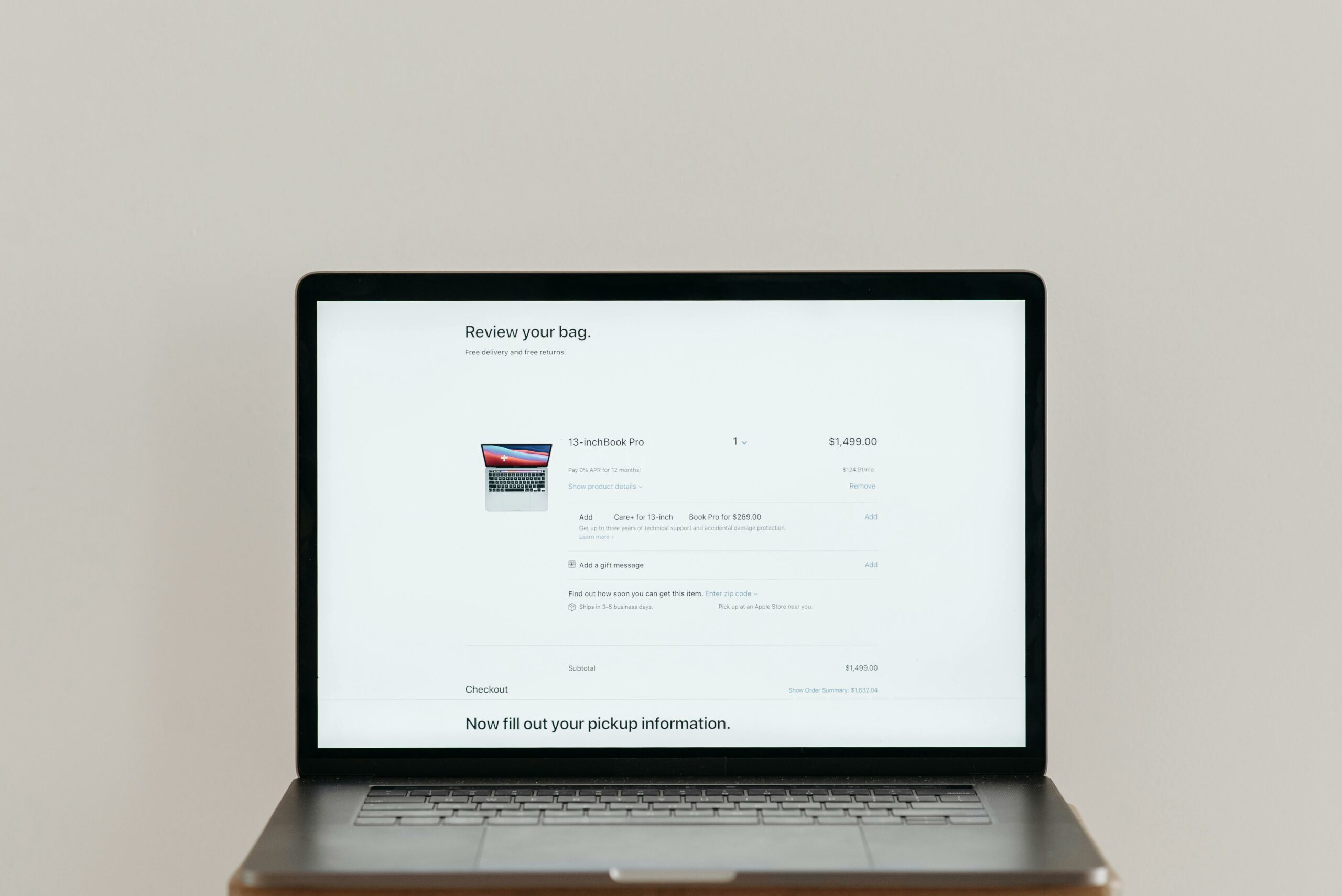
Practical example: if a creator says “Use my code for 15% off,” your hero section should show the code, the discount, and the button that applies it. Do not hide the offer in a paragraph below the fold.
Design the page like a conversion funnel, not a mini website
Mobile visitors do not browse the way desktop visitors do. They scan, they hesitate, and they tap the wrong thing if your spacing is tight. Treat your landing page like a guided path with controlled choices. That means fewer navigation links, fewer competing buttons, and a layout that reads well with one thumb. If you need multiple products, start with a curated bundle or a single hero SKU, then offer alternatives below.
Use a predictable structure: hero, benefits, proof, details, FAQ, final CTA. Keep paragraphs short, but make them specific. Replace vague claims like “premium quality” with measurable details like “stainless steel, dishwasher safe, ships in 24 hours.” For influencer traffic, include a short “As seen on TikTok” or “Creator picks” label only if it is true and you can back it up.
- Tap targets: buttons at least 44px tall, with generous spacing.
- Sticky CTA: for long pages, a sticky bar can help, but test it because it can also feel pushy.
- Form fields: if you need a lead, ask for email first, then collect extra details later.
For more campaign planning context, browse the practical guides in the InfluencerDB blog and align your page structure with the traffic source and creator format you are using.
Speed and technical setup that actually moves conversion rate
Speed is not just a technical metric, it is a conversion lever. In influencer campaigns, many clicks happen inside Instagram or TikTok in-app browsers, which can be slower and more fragile than Chrome or Safari. Prioritize a fast first load, stable layout, and minimal script bloat. Also, avoid heavy autoplay video at the top unless you have tested it on mid-range devices and weaker connections.
Use Google’s guidance to keep performance measurable and consistent. Start by checking Core Web Vitals and fixing the biggest bottlenecks first. A common win is compressing images, using modern formats, and deferring non-essential scripts. Another win is removing third-party widgets that add seconds but do not lift conversion.
PageSpeed Insights documentation explains how to diagnose real issues like render-blocking resources and layout shift. Concrete takeaway: run tests on a real phone, on cellular, and inside an in-app browser, then fix the slowest element before you redesign anything.
Copy that matches creator intent and reduces drop-off
Influencer traffic is context-heavy. People arrive with a story in their head: the creator’s demo, their personal result, or a problem they want solved. Your copy should pick up that thread immediately. Use the same words the creator used, especially for the problem and the outcome. Then add the details the creator could not fit into a short video: sizing, ingredients, compatibility, shipping, and support.
Write the hero section like this: benefit first, proof second, action third. For example: “Clear skin in 30 days – dermatologist tested – Start your routine.” Keep the CTA verb specific: “Get the bundle,” “Claim 15% off,” or “Start free trial.” Avoid generic CTAs like “Submit” or “Learn more” unless the goal is truly informational.
- Message match checklist: same offer, same product name, same price anchor, same creator code placement.
- Objection handling: add 3 short FAQs that address the top reasons people hesitate.
- Trust cues: show payment icons, shipping timelines, and a real support email.
Tracking and attribution: the minimum viable measurement plan
If you cannot measure, you cannot improve. For a mobile landing page, your tracking plan should cover three layers: click tracking, on-page behavior, and conversion tracking. Start with clean URLs per creator using UTM parameters, plus a creator code if you sell direct. When possible, connect server-side tracking or platform APIs to reduce signal loss from browser restrictions.
Here is a simple setup that works for most teams:
- UTMs: source = platform, medium = influencer, campaign = campaign name, content = creator handle.
- Pixel and events: view content, add to cart, initiate checkout, purchase, lead.
- Creator code: mirrors the UTM content value so you can reconcile reports.
Meta’s official guidance on pixels and events is a useful reference when you are troubleshooting missing conversions or mismatched event counts. Use it to confirm event naming and deduplication rules before you assume the page is the problem.
Meta Pixel setup guidance can help you validate that events fire correctly on mobile. Concrete takeaway: verify tracking with a test purchase or test lead on a real device, then compare analytics, ad platform, and backend counts to spot gaps.
Benchmarks and formulas: know what “good” looks like
Benchmarks vary by industry, price point, and traffic quality, so treat them as directional. Still, you need a baseline to decide whether to fix the page, change creators, or adjust the offer. Use a simple unit economics model to decide how much you can afford to pay for traffic and conversions.
Example calculation: If your average order value (AOV) is $60 and your gross margin is 60%, your gross profit per order is $36. If you want at least $10 contribution margin after marketing, your target CPA is $26. That number tells you how aggressive your landing page optimization needs to be.
| Metric | Formula | Why it matters on mobile |
|---|---|---|
| Conversion rate (CVR) | Conversions / Sessions | Shows whether the page turns clicks into outcomes |
| Revenue per session (RPS) | Revenue / Sessions | Captures both CVR and AOV, useful for offer tests |
| Cost per acquisition (CPA) | Spend / Conversions | Connects creator cost and paid spend to results |
| Break-even CPA | (AOV x Gross Margin) – Desired Contribution | Defines the maximum you can pay per conversion |
Decision rule: if CVR is low across multiple creators with similar audiences, fix the page first. If CVR is strong for one creator but weak for others, your issue is likely traffic quality or message mismatch.
A/B testing plan: what to test first (and what to ignore)
Testing is where most teams waste time, because they test tiny changes before fixing big leaks. Start with high-impact elements that influence understanding and trust. Then move to offer framing and layout. Keep one variable per test where possible, and run tests long enough to avoid day-to-day noise. If your traffic is low, use sequential tests and focus on bigger differences.
| Test priority | What to change | Hypothesis | Success metric |
|---|---|---|---|
| 1 | Hero headline + CTA | Clearer value increases taps and reduces bounce | CVR, bounce rate, CTA clicks |
| 2 | Offer structure (bundle, discount, free shipping) | Better offer fit increases checkout starts | Initiate checkout rate, RPS |
| 3 | Social proof placement | Earlier proof reduces hesitation on mobile | Scroll depth, CVR |
| 4 | Form length or checkout friction | Fewer steps increase completion rate | Lead completion, purchase CVR |
Concrete takeaway: write the hypothesis in one sentence before you build the variant. If you cannot explain why a change should lift conversion, skip it.
Common mistakes that quietly kill mobile conversions
Most mobile landing page failures are not dramatic. They are small frictions that add up: a slow hero image, a confusing CTA, or an offer that is buried. Because influencer traffic is often top-of-funnel, these issues show up as “low quality traffic” when the real problem is the page. Fix the basics before you blame the creator.
- Too many choices: multiple CTAs, full navigation menus, or competing popups.
- Weak message match: creator promises one thing, page leads with another.
- Hidden costs: shipping or fees appear late, causing checkout abandonment.
- Overdesigned layouts: tiny fonts, low contrast, and cramped buttons.
- Broken tracking: missing events, duplicated conversions, or inconsistent UTMs.
Quick fix: watch 10 session recordings or do 10 live usability tests with coworkers on their phones. If people hesitate in the same spot, that is your next change.
Best practices for influencer traffic and paid amplification
Once the page works for organic creator clicks, you can scale with whitelisting and paid amplification. However, scaling changes the traffic mix, so keep your page flexible. Create modular sections you can swap based on the creator angle: problem-first, outcome-first, or ingredient-first. Also, keep a version of the page that loads extremely fast for cold traffic, with fewer heavy assets.
- Build creator-specific variants: swap the hero and proof to match each creator’s story.
- Use short URLs: easy to read in captions and on-screen overlays.
- Pin the offer: show the creator code near the top and confirm it in cart.
- Plan usage rights: if you will run ads, negotiate usage rights and duration upfront.
- Respect disclosure norms: keep “ad” and “sponsored” language consistent with platform and local rules.
Concrete takeaway: treat the landing page as part of the creator brief. If the creator is selling a specific benefit, give them a page that proves it quickly and makes the next step effortless.
Launch checklist: ship a mobile landing page with confidence
Use this checklist before any influencer drop or paid push. It forces you to confirm the essentials and prevents last-minute surprises. Most importantly, it keeps your team focused on outcomes rather than aesthetics.
- Headline matches the creator message and the offer is visible on the first screen
- One primary CTA, repeated after benefits and after FAQ
- Load speed tested on cellular and inside an in-app browser
- Tracking verified with UTMs, pixel events, and a test conversion
- Proof and risk reducers placed near the first CTA
- Checkout or form friction minimized, fields validated, errors readable
- Creator code works and is confirmed in cart or confirmation screen
If you do only one thing after launch, monitor performance by creator and by device. Then iterate weekly: fix the biggest leak, re-test, and document what changed. Over time, those small improvements compound into a landing page that reliably converts mobile traffic.