
Aesthetic Instagram feed design is not just about pretty posts – it is a repeatable system that helps people recognize you, trust you, and take action. The goal is consistency without boredom: a look that feels intentional, plus content that earns saves, shares, and profile visits. In this guide, you will build a simple framework for choosing a visual direction, planning your grid, shooting and editing efficiently, and measuring whether your feed is working. Along the way, you will also learn the marketing terms brands care about so your aesthetic supports growth and monetization.
What an aesthetic Instagram feed is – and what it is not
An aesthetic Instagram feed is a consistent visual and editorial style across your grid, Reels covers, Stories highlights, and captions. It includes color palette, lighting, composition, typography, and even the topics you return to. However, it is not a rigid template that forces every photo to look identical. Instead, think of it as a set of guardrails that makes your content instantly recognizable while leaving room for variety.
To keep it practical, define three elements: your visual signature (color and light), your content pillars (what you post), and your audience promise (why people follow). If one of those is missing, the feed may look cohesive but fail to convert. For example, a minimalist beige grid can still underperform if the posts do not teach, entertain, or inspire a specific group. Your takeaway: write one sentence that links your look to your value, such as “clean, bright product demos for busy home cooks.”
Before you plan the grid, learn the performance language you will see in analytics and brand briefs. Reach is the number of unique accounts that saw your content, while impressions count total views including repeats. Engagement rate is typically engagements divided by reach or followers, depending on the report – always clarify which one you use. CPM is cost per thousand impressions, CPV is cost per view (often for video), and CPA is cost per acquisition (a purchase or lead). Whitelisting means a brand runs ads through your handle, usage rights define where and how long a brand can reuse your content, and exclusivity limits you from working with competitors for a period. These terms matter because a strong aesthetic can raise CPM by improving thumb stop and brand recall.
Aesthetic Instagram feed foundations: pick pillars, palette, and rules
Start with content pillars because they prevent you from building a beautiful grid with no direction. Choose 3 to 5 pillars that you can sustain weekly. For a fitness creator, pillars might be “workout demos,” “meal prep,” “mindset,” and “client wins.” Next, choose a palette of 3 core colors plus 1 accent. You can pull these from your wardrobe, your home, or your niche, but keep them stable for at least 30 days so the algorithm and your audience can learn what to expect.
Then set rules you can follow under pressure. Good rules are specific and measurable, not vibes. Examples: shoot near a window between 9 am and 1 pm, keep highlights covers in one font, use the same border thickness on quote posts, and avoid mixing warm and cool white balance in the same carousel. Finally, decide your “grid rhythm,” meaning the pattern of post types across nine tiles. A simple rhythm is 5 lifestyle or product shots, 2 carousels with text, and 2 Reels covers per nine posts.
Use this quick checklist before you commit to a direction:
- Pillars: 3 to 5 topics you can post without running out of ideas.
- Palette: 3 core colors + 1 accent, written down as names or hex codes.
- Lighting: one primary approach (bright natural, moody indoor, flash).
- Typography: one font family for text slides and covers.
- Composition: one default framing (centered, rule of thirds, close-up).
If you want more planning templates and creator strategy breakdowns, browse the InfluencerDB blog on influencer marketing and social growth and adapt the frameworks to your niche.
Plan your grid with a simple 3 layer system
Grid planning gets easier when you separate it into three layers: story, format, and look. Story is the narrative across your last 9 to 12 posts, such as “summer reset week” or “new product launch.” Format is the mix of Reels, carousels, and single images. Look is the consistent editing approach that ties it together. When creators struggle, it is usually because they try to solve all three at once in the moment of posting.
Here is a step-by-step method you can run every Sunday in under an hour. First, pick one weekly story theme and write 5 post ideas that support it. Second, assign formats based on the job each post must do: Reels for reach, carousels for saves, and single images for brand identity. Third, choose a “hero” visual for the week, like one location or one prop, so your grid feels connected even if topics vary. Finally, draft captions with one clear call to action, such as “save this,” “comment your question,” or “tap the link in bio.”
| Post type | Best for | What to optimize | Concrete aesthetic tip |
|---|---|---|---|
| Reels | Reach and discovery | Hook in first 1 to 2 seconds, clear subject, captions | Use consistent cover style: same font, same margin, same color accent |
| Carousel | Saves and shares | Strong first slide, scannable text, payoff at the end | Keep text slides to 2 colors and one font weight hierarchy |
| Single photo | Brand identity | Composition, lighting, recognizable palette | Repeat one signature element: background texture, prop, or framing |
| Story set | Community and conversion | Polls, Q and A, link stickers, replies | Use one highlight cover system and consistent sticker colors |
Decision rule: if your growth is flat, increase Reels volume before you redesign your grid. A better aesthetic helps, but distribution usually needs a format shift first. For official format guidance and current specs, reference Instagram’s help documentation at Instagram Help Center in a separate tab while you plan.
Shoot and edit faster without losing consistency
Consistency comes from process, not perfection. Build a small “shot list library” you can reuse: 10 angles, 10 B roll clips, and 10 background setups that match your palette. Then batch produce. For example, shoot three outfits in one location, or film five recipe steps in one afternoon. When you batch, you also reduce the risk of mixing lighting and color temperature across posts, which is one of the fastest ways to break cohesion.
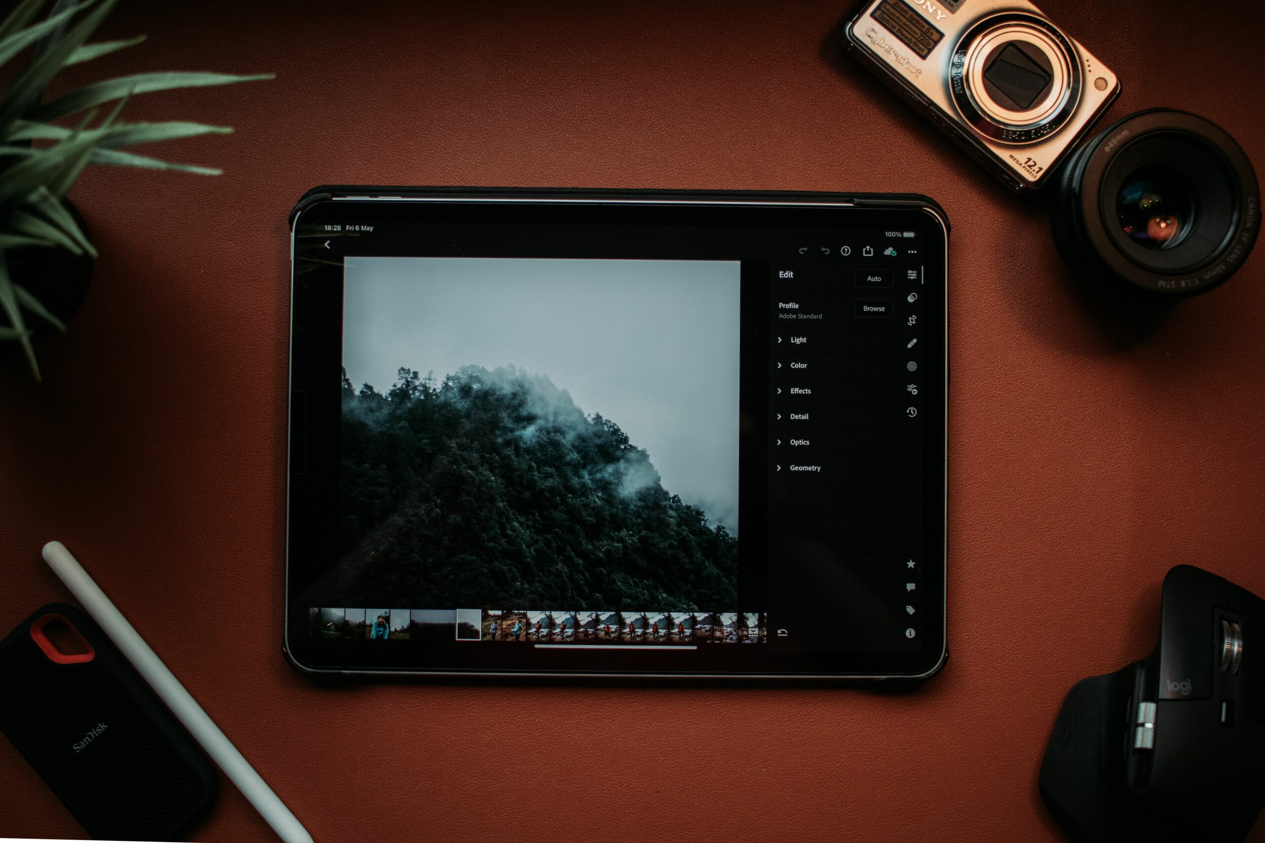
Editing is where most feeds either level up or fall apart. Pick one preset or baseline adjustment and apply it to everything, then tweak per photo. Your baseline can be as simple as: exposure +0.3, highlights -20, shadows +15, temperature +3, saturation -5, and a mild sharpen. The exact numbers will vary, but the point is you start from the same place every time. Also, lock in skin tones. If your skin looks orange in one post and gray in the next, the grid feels messy even if the palette is consistent.
To keep your workflow clean, use a two-folder system: “Ready to post” and “Needs edit.” Add a naming convention like “2026-07-Location-Theme-01” so you can find assets quickly. If you collaborate with a brand, save a separate export with usage rights in mind: high resolution, no platform watermark, and a neutral cover option. That makes negotiations easier later when a brand asks for paid usage or whitelisting.
Make your aesthetic support growth metrics brands care about
A cohesive look is valuable because it can improve retention and conversion signals. Still, you need to connect the aesthetic to measurable outcomes. Track reach and impressions to understand distribution, then track saves, shares, and profile visits to understand intent. If you sell products or drive affiliate clicks, add link clicks and conversions. For brand work, you will often be asked for engagement rate, average views, and audience demographics.
Use simple formulas so you can speak clearly in pitches. Engagement rate by reach is: (likes + comments + saves + shares) / reach. Engagement rate by followers is: (total engagements) / followers. Neither is “right” in all cases, but reach-based is often more honest for Reels-heavy accounts. Example: a Reel has 25,000 reach and 1,250 total engagements. Engagement rate by reach = 1,250 / 25,000 = 0.05, or 5%.
Now connect that to pricing language. CPM is: cost / (impressions / 1,000). If a brand pays $600 for a Reel that delivers 80,000 impressions, CPM = 600 / 80 = $7.50. If your aesthetic improves watch time and increases impressions to 110,000 on similar content, CPM drops to $5.45 for the brand, which makes you easier to rebook. The takeaway: treat your visual system as performance optimization, not decoration.
| Metric | What it tells you | Healthy direction | Aesthetic lever to test |
|---|---|---|---|
| Reach | How many unique people saw it | Up over 4 weeks | Clear subject, brighter lighting, less visual clutter |
| Impressions | Repeat views and distribution | Higher than reach | Stronger cover consistency, tighter hook framing |
| Saves | Future intent and value | Up on carousels | Readable typography, consistent slide layout, high contrast |
| Shares | Virality and social proof | Up on relatable posts | Recognizable color accent, meme format that matches your brand |
| Profile visits | Interest in you, not just the post | Up after Reels | Unified grid rhythm so the profile converts on first glance |
Brand readiness: usage rights, exclusivity, and whitelisting
Once your feed looks consistent, brands will assume you can deliver consistent creative. That is good, but it also raises the stakes on contracts. Usage rights determine whether a brand can repost your content, use it in ads, or place it on a product page. Exclusivity determines whether you can work with competing brands for a set time. Whitelisting lets the brand run paid ads through your handle, which can boost performance but also ties your identity to the ad.
Here is a practical negotiation framework. First, separate the creative fee from usage. Second, price usage by scope and time: organic reposting for 30 days is different from paid ads for 6 months. Third, define deliverables precisely: number of Reels, length, number of story frames, link sticker inclusion, and whether you provide raw files. Finally, add a clause about edits: one round of minor edits included, additional edits billed hourly or per round. If you need a baseline for disclosure expectations, review the FTC’s guidance on endorsements at FTC Endorsement Guides resources.
Concrete takeaway: keep a one-page “creator terms” document ready. Include your standard usage window, whitelisting policy, exclusivity categories, and turnaround time. When a brand asks for a rate, you can respond with numbers plus terms, which signals professionalism.
Common mistakes that ruin cohesion (and how to fix them)
The most common mistake is chasing trends that do not match your visual system. A trending filter can spike reach once, then make your grid look random for months. Instead, adapt trends to your palette and typography. Another frequent issue is inconsistent white balance, especially when you mix indoor tungsten light with daylight. Fix it by choosing one lighting setup per batch shoot and correcting temperature before you apply your preset.
Creators also overuse text overlays with too many fonts, colors, and sizes. Keep one font family and two weights, then set a standard margin so text always sits in the same place. Finally, many people plan the grid but ignore Reels covers, which are now a major part of the profile view. Design covers as a system: same background treatment, same title length, and one accent color. If you need a quick audit, scroll your last 12 posts and ask: do they look like one creator made them in the same month?
Best practices: a repeatable weekly workflow
A strong feed is the result of small weekly habits. Start by reviewing last week’s top two posts and bottom two posts. Identify one variable to test next week, such as brighter exposure, tighter cropping, or simpler backgrounds. Then plan your next 7 days with a format mix that matches your goal: more Reels for reach, more carousels for saves, and more Stories for conversion. Keep the test small so you can attribute results.
Use this weekly workflow as your default:
- Monday: pick the weekly theme and draft 5 hooks.
- Tuesday: batch shoot photos and B roll in one lighting setup.
- Wednesday: batch edit using one baseline preset, export covers.
- Thursday: schedule posts, write captions, add alt text and hashtags.
- Friday: post a community prompt in Stories, reply to DMs.
- Weekend: review metrics, save winning templates, update shot list.
Decision rule: if you cannot maintain the aesthetic in a busy week, simplify the rules rather than quitting the system. A consistent “good” look beats occasional perfection. Over time, that reliability is what turns a nice grid into a brand asset.
Mini audit: score your profile in 10 minutes
Close this tab, open your profile, and run a fast audit. First, look at your grid from arm’s length. Can you identify your palette in two seconds? Next, open your Reels tab and check whether covers look like a series. Then read your bio and ask whether it matches the visual promise of the feed. If your grid says luxury skincare but your bio is vague, conversion will suffer.
Score each item from 1 to 5 and pick one fix for this week:
- Palette consistency across last 12 posts
- Lighting consistency across last 12 posts
- Cover system consistency across last 12 Reels
- Typography system consistency on carousels
- Content pillars visible within last 9 posts
If you want to go deeper, document your scores and re-audit monthly. That creates a simple before-and-after record you can share with brands as proof that your creative system is improving performance, not just aesthetics.