Checkout conversion psychology is the fastest way to find hidden revenue on your site because it targets the exact moment shoppers decide to buy or bail. In 2026, the best gains rarely come from louder promos – they come from reducing cognitive load, increasing trust, and making the next step feel safe and obvious. This guide breaks down practical, testable changes you can ship in days, not quarters. You will also get simple formulas, example calculations, and two tables you can use to plan experiments. Along the way, we will translate psychology into concrete UI and copy decisions that improve completed orders without tricking customers.
Define the metrics and terms you will use before you change anything
Before you redesign a checkout, lock your definitions so you can measure impact cleanly. Start with checkout conversion rate: completed purchases divided by checkout sessions. If you can, split it into step conversion rates (shipping step completion, payment step completion, review step completion) to pinpoint where friction lives. Next, define CPA (cost per acquisition) as ad spend divided by purchases, and remember that checkout improvements reduce CPA even if your ads do not change. Finally, define reach and impressions if you run creator or paid social traffic: reach is unique people, impressions are total views, and both affect how many users enter checkout.
Influencer and paid social teams also need shared language for video metrics and creator deals because those inputs change checkout quality. CPM is cost per thousand impressions, CPV is cost per view, and engagement rate is engagements divided by impressions or followers (pick one and stick to it). Whitelisting means running ads through a creator handle with permission, usage rights define where and how long you can reuse creator content, and exclusivity limits the creator from working with competitors. These terms matter because a whitelisted creator ad can raise trust at checkout, while unclear usage rights can block you from reusing the best-performing creative that drives the highest-intent sessions.
Takeaway checklist:
- Write down your primary KPI: completed orders per checkout session.
- Track step-level drop-off so you know which screen to fix first.
- Standardize CPM, CPV, CPA, engagement rate, reach, and impressions definitions across teams.
- Tag traffic sources (creator, paid social, email) so you can see which audiences struggle at checkout.
Checkout conversion psychology starts with friction and cognitive load

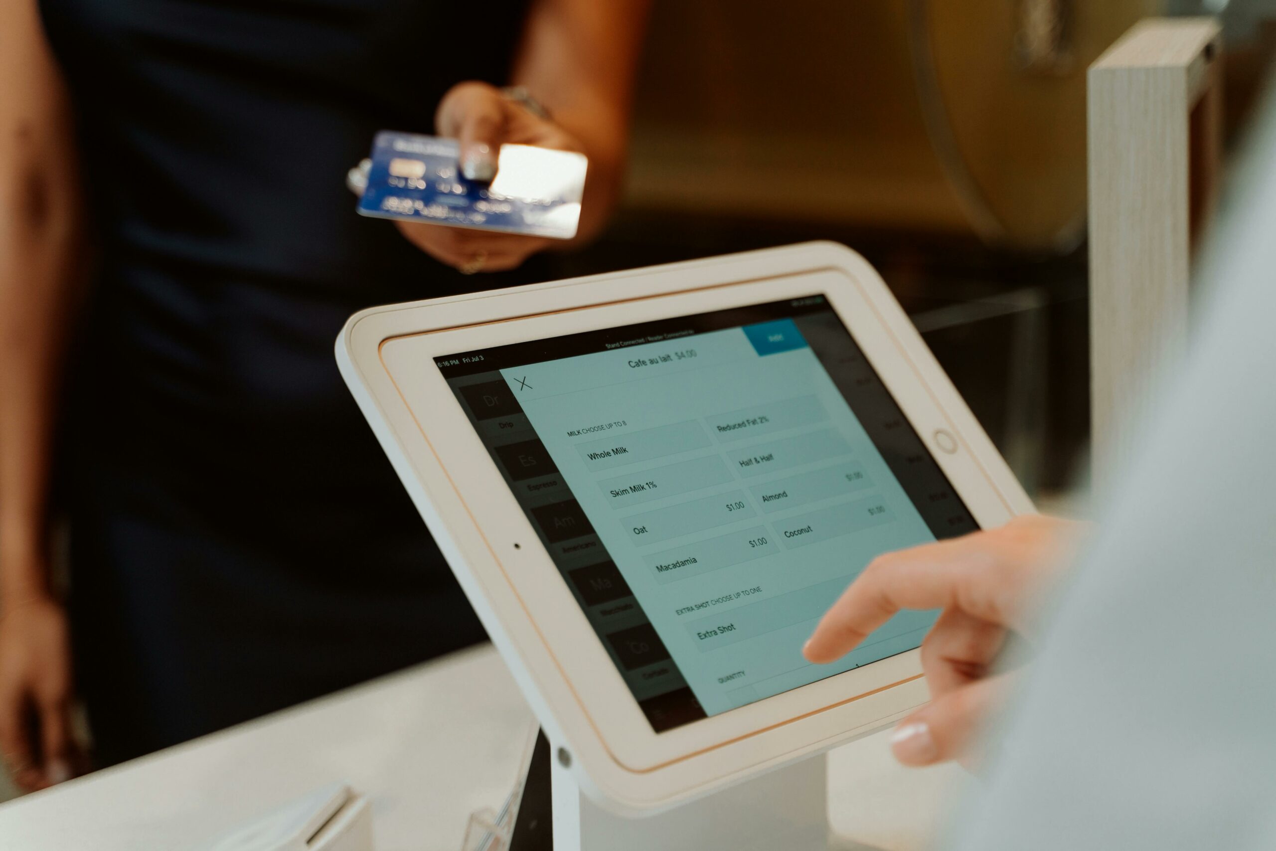
Most checkout losses are not about price – they are about effort, uncertainty, or distraction. Cognitive load is the mental work required to understand what is happening and what to do next. When the load is high, shoppers default to postponing the decision, which looks like abandonment. Your job is to make the next action feel effortless and reversible, while keeping the user oriented. That means fewer fields, clearer labels, and fewer surprises.
Use a simple audit: open your checkout on a phone, then count how many decisions the user must make. Every dropdown, optional upsell, and unclear error message adds decision fatigue. Next, reduce form friction with autofill, address lookup, and smart defaults (for example, default shipping country based on IP but allow easy change). Also, show progress in plain language, such as “Shipping – Payment – Review,” because people persist when they can see the finish line.
Microcopy does heavy lifting here. Replace vague labels like “Continue” with specific outcomes like “Continue to payment.” If you require a phone number, explain why in one short line, such as “For delivery updates only.” When errors happen, place the message next to the field and tell the user exactly how to fix it. For accessibility and speed, keep input types correct (email keyboard for email, numeric keypad for card and ZIP).
Decision rules you can apply today:
- If a field does not reduce fraud, improve delivery, or meet legal needs, remove it.
- If a step contains more than one primary decision, split it or simplify it.
- If users must scroll to find the main button, move it higher or make it sticky.
- If an error message does not include the fix, rewrite it.
Use trust cues and risk reversal to reduce last-second doubt
Checkout is where skepticism peaks. Shoppers worry about payment security, returns, delivery timing, and whether the brand will support them if something goes wrong. Trust cues work when they answer those fears without cluttering the page. Place the most relevant reassurance near the decision point: shipping and returns near delivery options, security near payment, and support near the final “Place order” button. Keep the language specific, not generic.
Risk reversal is the psychology of making the downside feel smaller. A clear return window, easy exchanges, and transparent delivery estimates reduce perceived risk. If you offer a guarantee, state it in one line and link to details. Also, show real support options: “Chat – replies in under 2 minutes” is more credible than “24/7 support” if you cannot back it up. For payment trust, display accepted payment methods and use recognizable security language, but avoid overloading with badges that look spammy.
Social proof can help, but only if it is relevant to checkout. Instead of generic star ratings, show “X bought in the last 24 hours” only if it is true and updated. Better yet, show “Free returns – 4.8 average support rating” if you can substantiate it. If you use creator content, a small “As seen in” or creator quote can reinforce legitimacy, but do not let it push the primary button below the fold.
For a deeper view on how marketers evaluate performance signals and attribution, keep an eye on the practical measurement guides on the InfluencerDB blog, especially when you are tying checkout lifts back to campaign sources.
Takeaway checklist:
- Put delivery date ranges and return policy summary on the same screen as shipping selection.
- Add one support promise you can prove (response time, hours, channel).
- Show payment method icons and a short security line near card entry.
- Use social proof only if it is current, truthful, and close to the decision it supports.
Make pricing feel fair: anchoring, transparency, and fee timing
Pricing psychology at checkout is less about manipulation and more about avoiding surprise. The biggest conversion killer is a late fee reveal, such as shipping or taxes that appear after the user invests time. In 2026, shoppers expect transparency because they compare across tabs and apps. Show estimated totals early, and update totals instantly when options change. If you cannot calculate taxes until address entry, say so upfront.
Anchoring can still help ethically. If you offer free shipping over a threshold, anchor the goal with a progress message like “$12 away from free shipping,” but only if it does not interrupt checkout flow. Similarly, if you offer a subscription discount, present it as a clear comparison: “One-time purchase $48 – Subscribe and save 10% $43.20.” Avoid hiding the renewal terms; instead, put the cancellation policy in plain language next to the option.
When you use discount codes, decide whether the code box should be visible or collapsed. A visible code field can trigger “deal hunting” and increase abandonment. A collapsed “Have a code?” link reduces distraction, but it can frustrate users who already have a code. The practical approach is to segment: show the field expanded for email and affiliate traffic where codes are common, and collapsed for high-intent direct traffic. If you cannot segment, keep it collapsed but easy to open.
Formula and example: If your current checkout conversion rate is 42% and you run 20,000 checkout sessions per month, completed orders are 0.42 x 20,000 = 8,400. If a transparency change lifts conversion to 45%, orders become 0.45 x 20,000 = 9,000. That is 600 additional orders without increasing traffic.
Experiment plan: prioritize changes with an impact vs effort table
Psychology ideas are cheap, but engineering time is not. Therefore, build a short experiment backlog and score it. Start with the highest drop-off step, then list 8 to 12 potential fixes. Score each by expected impact (1 to 5), confidence (1 to 5), and effort (1 to 5). A simple ICE variant works: (Impact x Confidence) divided by Effort. This keeps you honest and prevents you from shipping “fun” changes that do not move the number.
| Hypothesis | Psychology lever | Where to apply | Impact (1-5) | Effort (1-5) | Notes |
|---|---|---|---|---|---|
| Reducing fields increases completion | Cognitive load reduction | Shipping address | 5 | 3 | Remove company field, enable autofill, keep optional fields truly optional |
| Clear delivery dates reduce anxiety | Uncertainty reduction | Shipping method | 4 | 2 | Show date range per method, update instantly after ZIP entry |
| Sticky CTA improves mobile flow | Friction reduction | Payment and review | 3 | 2 | Keep primary button visible, avoid covering legal links |
| Support promise increases trust | Risk reversal | Final review | 3 | 1 | Add “Chat replies in under X minutes” only if true |
| Collapse promo field reduces distraction | Attention control | Order summary | 2 | 1 | Test by traffic source if possible |
Once you pick the top tests, set guardrails. Track not only conversion, but also refund rate, chargebacks, and customer support contacts. A change that boosts orders but increases refunds can be a net loss. For measurement, use a consistent analytics setup and document exactly what changed, when it shipped, and which devices it affects.
If you need a reference for credible experimentation practices and statistical basics, this HubSpot guide is a solid starting point: A/B testing fundamentals.
Copy and layout patterns that reliably lift completion
Good checkout copy is short, specific, and timed to the user’s question. On shipping, the question is “When will it arrive and what will it cost?” On payment, it is “Is this secure and can I pay my way?” On review, it is “Can I fix mistakes and what happens next?” Answer those questions in-line, not in a separate FAQ page. Also, keep the visual hierarchy simple: one primary action, one secondary action, and minimal competing elements.
Here are patterns that tend to work across categories:
- Inline reassurance: “Free returns within 30 days” near the total, not buried in the footer.
- Specific CTAs: “Continue to payment” and “Place order” instead of generic “Next.”
- Editable summary: Show cart items and shipping address with an “Edit” link so users do not fear being trapped.
- Smart defaults: Preselect the most common shipping method, but keep alternatives visible.
- Progress indicator: Make steps obvious and consistent across devices.
For mobile, spacing is conversion. Increase tap targets, avoid tiny checkboxes, and ensure the keyboard does not hide the primary button. If you use one-page checkout, add clear section headers and collapse completed sections so the page does not feel endless. If you use multi-step checkout, keep the number of steps low and avoid forcing account creation mid-flow.
How to connect influencer and paid traffic quality to checkout outcomes
Checkout performance depends on who arrives there. Creator traffic can be high intent when the content demonstrates the product clearly, sets expectations, and attracts the right audience. On the other hand, a viral clip can drive curious clicks that inflate sessions but lower checkout conversion. That is why you should evaluate traffic quality with a simple funnel view: landing page view to add-to-cart, add-to-cart to checkout start, and checkout start to purchase. When checkout conversion drops, check whether the mix of sources changed.
Use basic formulas to compare sources. For each source, compute purchase rate = purchases divided by sessions, and revenue per session = revenue divided by sessions. Then compute effective CPA for creator campaigns if you pay a flat fee: effective CPA = creator fee divided by purchases attributed to that creator. If you run whitelisting, track the paid CPA separately because the creative and audience targeting can change the outcome. This is also where usage rights matter: if a creator’s ad drives higher-quality sessions, you want the right to reuse that asset long enough to amortize production costs.
When you negotiate creator deals, tie deliverables to measurable outcomes without promising a specific conversion rate. For example, specify that the creator must show the product in use, demonstrate key steps, and include a clear call to action. Those creative choices reduce uncertainty and can raise checkout completion because shoppers arrive with fewer unanswered questions. If you need a practical library of campaign planning and measurement ideas, browse the strategy posts on and adapt the templates to your funnel.
| Term | Definition | Why it affects checkout | Quick example |
|---|---|---|---|
| CPA | Cost per acquisition = spend / purchases | Checkout lifts reduce CPA without changing spend | $10,000 / 400 = $25 CPA |
| CPM | Cost per 1,000 impressions | High CPM can still be profitable if checkout converts well | $30 CPM on 100k imps = $3,000 |
| CPV | Cost per video view | Low CPV can bring low-intent traffic that struggles at checkout | $0.02 CPV for 50k views = $1,000 |
| Engagement rate | Engagements / impressions (or followers) | Engagement can signal resonance, not purchase intent | 2,000 / 50,000 = 4% |
| Reach | Unique people who saw content | Helps estimate top-of-funnel size and frequency | Reach 40k, impressions 80k means 2x frequency |
| Impressions | Total times content was shown | High impressions with low adds-to-cart can indicate mismatch | 200k imps, 1k clicks, 10 purchases |
| Whitelisting | Running ads via creator handle with permission | Can increase trust and improve checkout completion | Creator ad CPA drops from $40 to $28 |
| Usage rights | Permission to reuse creator content | Lets you keep best-performing creative live during peak season | 6-month paid usage across Meta and TikTok |
| Exclusivity | Limits creator from working with competitors | Protects trust, but increases cost and can reduce creator availability | 30-day category exclusivity |
Common mistakes that quietly kill checkout conversion
Some checkout problems are obvious, like broken payment buttons. The costly ones are subtle and persistent. One common mistake is adding “helpful” elements that compete with the primary action, such as large upsells, popups, or multiple CTAs. Another is forcing account creation before purchase, which increases effort and triggers privacy concerns. Also, many teams test too many changes at once, which makes results hard to trust and slows learning.
Watch for these practical pitfalls:
- Late fee surprises: shipping, taxes, or handling fees revealed after payment entry.
- Weak error handling: generic “Something went wrong” messages with no fix.
- Over-optimized promo code UX: encouraging code hunting instead of completion.
- Mobile neglect: tiny tap targets, hidden CTAs, and slow load times.
- Trust clutter: too many badges and claims that feel unverified.
Best practices for 2026: a practical checklist you can hand to your team
Checkout improvements work best as a system: measurement, UX, copy, and traffic quality all reinforce each other. Start by fixing the biggest drop-off step, then ship small changes weekly. Document every test with a hypothesis, screenshots, and the exact metric you expect to move. Keep your promises honest, especially around delivery, returns, and support, because trust is fragile and refunds are expensive.
Best-practice checklist:
- Show total cost expectations early and update totals instantly.
- Reduce fields and enable autofill, address lookup, and correct keyboard types.
- Use specific CTAs and place reassurance next to the relevant decision.
- Segment promo code UX by traffic source when possible.
- Run A/B tests with clear hypotheses and guardrails (refunds, chargebacks, support tickets).
- Audit creator and paid traffic quality with step-level funnel metrics, not clicks alone.
For policy clarity and consumer trust standards, it also helps to align your checkout disclosures with widely accepted guidance. The Federal Trade Commission’s consumer protection resources are a useful reference point when you are reviewing claims, pricing transparency, and advertising practices: FTC.
If you apply the framework in this guide, you will end up with fewer surprises, fewer decisions, and more confidence at the moment of purchase. That is the core of conversion: make the right action feel easy, safe, and clearly worth it.