Color coordination guide – that is the fastest way to make your content look more expensive, more intentional, and easier to watch in 2026. Whether you are a creator filming in a bedroom studio or a brand producing UGC at scale, color is doing quiet work: it shapes attention, trust, and even perceived product quality. The good news is you do not need a design degree to get consistent results. You need a repeatable system, a few decision rules, and a way to measure whether your choices help performance. This guide gives you a practical workflow you can use for TikTok, Instagram, YouTube, and paid whitelisting.
What color coordination means in influencer marketing (and why it affects performance)
Color coordination is the deliberate planning of colors across wardrobe, background, props, product packaging, and on-screen graphics so the frame feels cohesive. In influencer marketing, that cohesion is not just aesthetic. It can improve clarity (viewers understand what to look at), strengthen brand recall (consistent hues become a memory cue), and reduce visual friction (less scrolling away). As a result, color choices can influence thumb-stop rate, view duration, and click intent, especially on short-form video where viewers decide in seconds.
To keep this practical, treat color like a performance variable you can control. Start by defining what must be consistent (brand colors, hero product color, creator set) and what can change (accent colors, seasonal tones). Then decide where color will do the heavy lifting: making the product pop, making skin tones look healthy, or making text overlays readable. If you want a deeper library of creator and campaign planning tactics, browse the InfluencerDB Blog resources for influencer campaigns and apply the same testing mindset to visuals.
Concrete takeaway: Pick one primary goal for color in each piece of content – product emphasis, brand consistency, or readability – and optimize for that goal first.
Key terms you will use when color choices tie into campaign results

Color is creative, but influencer work is still measured. Here are the core terms brands and creators use when they evaluate content performance and negotiate deliverables. Keep these definitions handy so you can connect visual decisions to outcomes without hand-waving.
- Reach: Unique accounts that saw the content at least once.
- Impressions: Total views, including repeat views by the same person.
- Engagement rate: Engagements divided by reach or impressions (define which one). Example: (likes + comments + saves + shares) / reach.
- CPM: Cost per 1,000 impressions. Formula: (cost / impressions) x 1000.
- CPV: Cost per view (often for video views). Formula: cost / views.
- CPA: Cost per acquisition (purchase, signup, lead). Formula: cost / conversions.
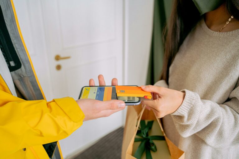
- Whitelisting: Brand runs ads through a creator account (or uses creator handle) to leverage social proof and targeting.
- Usage rights: Permission for the brand to reuse creator content (organic, paid, web, email) for a defined time and scope.
- Exclusivity: Creator agrees not to work with competitors for a set period and category.
Why include these in a color guide? Because color coordination often becomes part of the brief, and the brief must map to measurement. If the brand is paying for whitelisting and usage rights, they will care more about legibility, safe margins for text, and consistent brand palette. If the KPI is CPA, you will prioritize product clarity and contrast over a moody aesthetic that looks nice but hides the call to action.
Concrete takeaway: Before you pick a palette, write down the primary KPI (CPM, CPV, or CPA) and optimize color for the behavior that supports it – attention, comprehension, or action.
Color coordination guide framework: a 6-step workflow you can reuse
This is the repeatable method. Use it for a single Reel, a 10-video UGC batch, or a full creator campaign. It is designed to be fast enough for weekly production and structured enough for brand approvals.
- Lock the hero color: Identify the one color that must be seen and remembered – often the product, packaging, or a brand anchor color.
- Choose a base neutral: Pick one of these as your default background and set tone: warm white, cool white, light gray, charcoal, or beige. Neutrals reduce risk and keep skin tones stable.
- Add one accent color: Use an accent for props, nails, a mug, a throw pillow, or a graphic element. One accent is usually enough for short-form.
- Set contrast rules: Decide minimum contrast for text overlays and product edges. If viewers cannot read the first line in half a second, you lose them.
- Plan wardrobe last: Wardrobe should support the hero color, not fight it. Avoid tiny patterns that shimmer on camera.
- Document it in a mini style card: Save a note with 3 hex codes, 2 neutrals, and 1 forbidden color. Share it with editors and brand partners.
When you need a quick decision rule, use the 60-30-10 approach: 60 percent base neutral, 30 percent secondary tone, 10 percent accent. It is not magic, but it prevents the most common mistake in creator sets: too many competing colors at equal intensity.
Concrete takeaway: Build a one-page style card for each recurring series so your content looks consistent even when you batch film across different days.
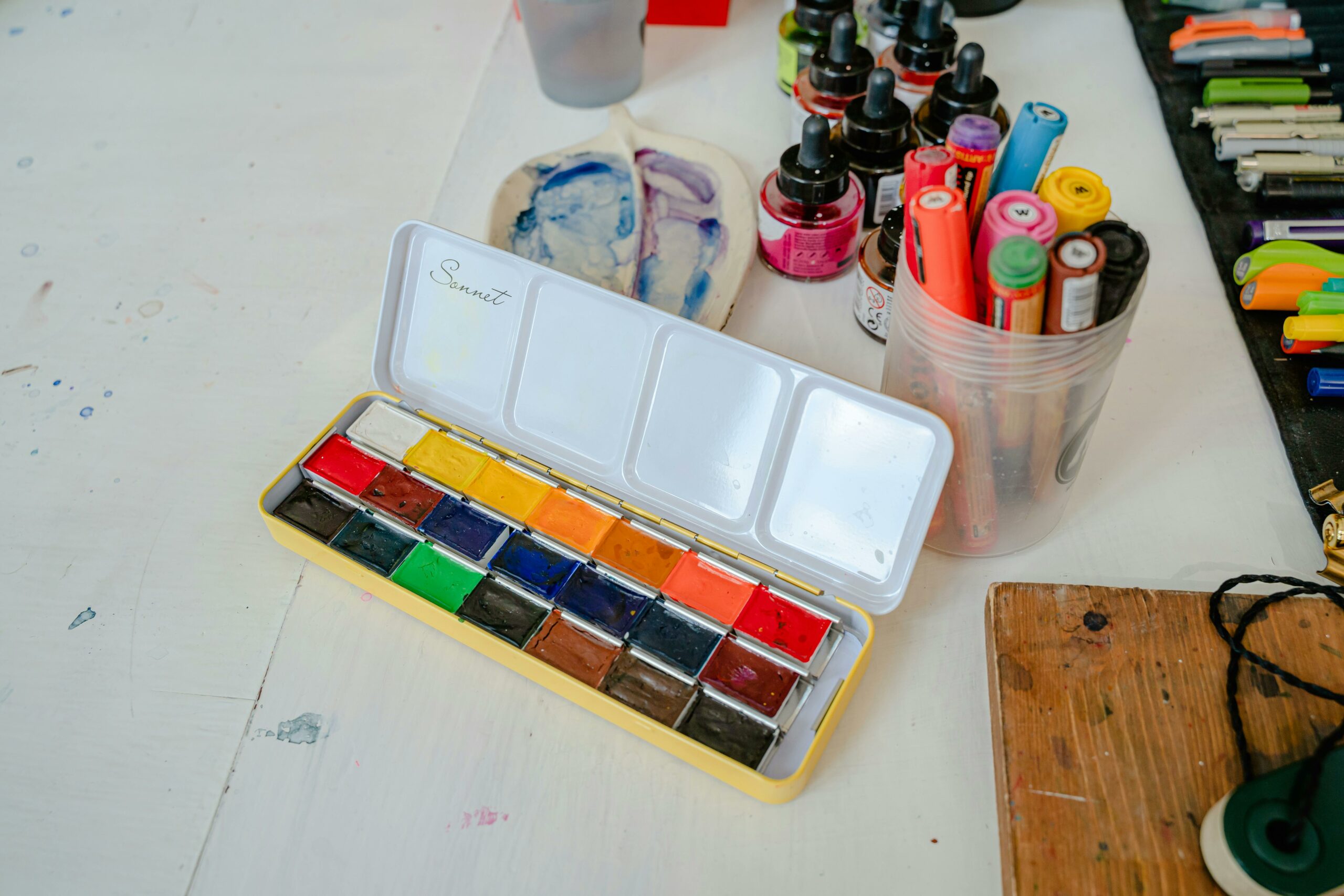
Palette recipes that work on camera (with a practical table)
Camera sensors and social compression punish subtlety. Colors that look fine in real life can turn muddy on TikTok, and neon accents can clip into ugly blocks. Start with proven palette recipes, then customize. If you are unsure, test by filming a 5-second clip and watching it on a phone at 50 percent brightness.
| Use case | Base neutral | Secondary color | Accent color | Best for |
|---|---|---|---|---|
| Skincare demo | Warm white | Soft beige | Sage green | Clean, calm, high trust |
| Tech unboxing | Cool light gray | Charcoal | Electric blue | Contrast, modern feel |
| Fitness coaching | Neutral gray | Black | Red | Energy, urgency, clarity |
| Food content | Off white | Wood tones | Deep green | Natural, appetizing warmth |
| Fashion try-on | Beige | Chocolate brown | Gold | Premium, flattering tones |
| Beauty glam | Soft gray | Dusty pink | Black | Face focus, readable text |
Next, match palettes to platform realities. TikTok and Reels often overlay UI elements and captions, so leave negative space and avoid light text on light backgrounds. YouTube thumbnails need bolder separation, so push contrast and simplify to two main colors plus skin tone.
For color accessibility, contrast matters more than taste. The W3C contrast guidance is built for readability and is a useful benchmark when you add text overlays or product labels in-frame. Reference: W3C WCAG guidelines.
Concrete takeaway: If you use text on video, test your first frame in grayscale. If the message disappears, increase contrast before you tweak hue.
How to connect color choices to KPIs (simple formulas and an example)
Color coordination is not a vanity exercise if you treat it like an experiment. Run A/B tests where only one variable changes: background color, wardrobe tone, or accent intensity. Keep hook, script, and length as similar as possible. Then compare early retention and downstream actions.
Use these simple calculations to translate creative changes into business language:
- Engagement rate (by reach): engagements / reach
- CPM: (cost / impressions) x 1000
- CPA: cost / conversions
Example: A brand pays $1,200 for a creator video plus 30-day usage rights for paid social. Version A uses a busy colorful background; Version B uses a warm white background with a single teal accent that matches packaging. Both get 100,000 impressions in whitelisted ads. Version A drives 40 purchases, Version B drives 60 purchases.
- CPA A = 1200 / 40 = $30
- CPA B = 1200 / 60 = $20
That $10 CPA difference is not abstract. It can justify stricter color direction in briefs, or higher creator rates if the creator consistently produces better-performing, brand-safe visuals. When you negotiate, tie your process to outcomes: you are not charging for a prettier frame, you are charging for repeatable performance.
If you need a standard reference point for ad measurement terms and how platforms define metrics, Meta documentation is a reliable place to check definitions before you report results. See: Meta Business Help Center.
Concrete takeaway: Track one creative variable per test and report the KPI delta in dollars (CPA) or efficiency (CPM), not just likes.
Briefing creators: what to specify about color (and what to leave flexible)
Color direction fails when briefs are either vague or overly controlling. Brands often write “use our brand colors” without explaining where those colors should appear. Creators, on the other hand, sometimes ignore brand palettes because they fear it will clash with their feed. A better approach is to specify non-negotiables, then give creators room to execute in their own style.
| Brief element | What to include | Why it matters | Creator-friendly tip |
|---|---|---|---|
| Hero color | Product or packaging color, plus one brand hex code | Ensures brand recall and product clarity | Let the creator choose props that echo the hue |
| Background guidance | Preferred neutrals and 1 to 2 banned colors | Avoids clashes and messy frames | Offer options: warm white or light gray |
| Text overlays | Font color rules and safe margins | Improves readability and ad approvals | Provide 2 preset styles, not 10 rules |
| Wardrobe | Solid colors preferred, avoid tight stripes | Prevents moire and distraction | Ask for “solid top in neutral” instead of a specific shirt |
| Usage context | Organic only or whitelisting and paid usage | Paid needs cleaner, brand-safe visuals | Offer a paid add-on for stricter styling |
Also define what “on-brand” means in one sentence. For example: “Bright, clean, minimal, with one bold accent.” That single line prevents endless revisions. If you are a creator, ask for a reference ad or two and confirm whether the brand cares more about matching packaging or matching the broader brand palette.
Concrete takeaway: Put color direction into three bullets: hero color, background neutral, and one accent. Everything else is optional unless paid usage is involved.
Common mistakes (and quick fixes you can apply today)
Most color problems are not about taste. They are about contrast, lighting, and competing focal points. Fixing them usually takes minutes, not a full reshoot.
- Mistake: Background matches the product, so the product disappears. Fix: Switch to a neutral background or add a contrasting tray under the product.
- Mistake: Too many saturated colors in frame. Fix: Remove one colorful prop and keep a single accent.
- Mistake: Skin tones look gray or orange. Fix: Set white balance manually and avoid mixed lighting (window light plus warm lamp).
- Mistake: Text overlays blend into the scene. Fix: Add a subtle solid background behind text or use a shadow with higher opacity.
- Mistake: Brand asks for exact colors, but creator camera cannot reproduce them. Fix: Match “family” (warm vs cool) and prioritize contrast over perfect hex accuracy.
Concrete takeaway: If something looks off, first simplify the frame. Remove items until the product and face are the only high-contrast elements.
Best practices for 2026: consistent color across organic, UGC, and whitelisted ads
In 2026, the same asset often lives in three places: organic creator post, brand repost, and paid whitelisted ad. That makes consistency more valuable, because audiences see variations side by side. At the same time, platforms compress video and shift color slightly, so you need guardrails that survive reposting.
- Create a “color-safe” filming setup: One key light, one neutral background, and a repeatable camera position. Consistency beats novelty for performance testing.
- Use accents to signal series: Keep the base neutral constant, then rotate accent colors by topic (tips, reviews, comparisons). Viewers learn the pattern.
- Plan for captions and UI: Leave clean space in the top and bottom thirds so overlays do not collide with busy colors.
- Agree on usage rights and edits: If the brand will add graphics later, specify who controls color grading and whether the creator can approve final paid versions.
- Build a simple review step: Before posting, check three screenshots: first frame, product close-up, and CTA frame. If those three are clear, the rest usually works.
Finally, treat color as part of your brand safety checklist. If you are running whitelisted ads, you want predictable results across placements. That means avoiding extreme filters, heavy color casts, and backgrounds that introduce accidental competitor colors. For more campaign planning and measurement guidance that complements creative decisions, explore additional playbooks in the.
Concrete takeaway: Standardize your base neutral and lighting first, then experiment with accents. You will get cleaner tests and fewer revisions.
A quick checklist you can copy into your next brief
Use this as a final pre-flight list for creators, brand managers, or editors. It keeps color direction specific without turning the brief into a design manual.
- Hero color: ________ (product or brand anchor)
- Base neutral: warm white / cool white / light gray / charcoal / beige
- Accent color: ________ (one only)
- Banned colors: ________ (1 to 2 max)
- Text overlay rule: dark text on light background or light text on dark background
- Wardrobe: solid top, no tight stripes, avoid matching product color
- Usage: organic only or includes whitelisting and paid usage rights
- Success metric: CPM / CPV / CPA, plus target benchmark
If you apply this checklist consistently, you will reduce reshoots, speed up approvals, and make your creative testing more reliable. Color is not the whole story, but it is one of the easiest levers to pull when you want content that looks intentional and performs under real measurement.