Color psychology marketing is one of the fastest ways to change how people feel about your offer – and how often they click, add to cart, and buy. In influencer campaigns, color choices matter even more because viewers decide in seconds whether a post looks trustworthy, premium, fun, or spammy. The goal is not to pick a favorite color; it is to pick a color system that supports the job of each asset: stop the scroll, clarify the message, and reduce friction at the moment of decision. To do that well, you need a few definitions, a repeatable testing method, and clear rules for CTAs, product shots, and creator briefs. This guide gives you practical steps you can apply in your next landing page refresh or creator campaign.
Color psychology marketing basics: what colors actually change
Color influences conversion through three levers: attention, meaning, and fluency. Attention is the simplest – high contrast and clear hierarchy help users find the button, price, and key benefit quickly. Meaning is cultural and contextual – red can signal urgency, danger, or discounting depending on category and execution. Fluency is about cognitive ease – when a page feels coherent, readable, and familiar, users perceive it as more credible and are more likely to complete the action.
Before you change anything, define the metrics you will use to judge “better.” In performance marketing and influencer tracking, these terms come up constantly:
- Reach – unique people who saw the content.
- Impressions – total views, including repeats.
- Engagement rate – engagements divided by impressions or reach (be explicit which one you use).
- CPM (cost per mille) – cost per 1,000 impressions. Formula: CPM = (Spend / Impressions) x 1000.
- CPV (cost per view) – cost per video view. Formula: CPV = Spend / Views.
- CPA (cost per acquisition) – cost per purchase, lead, or signup. Formula: CPA = Spend / Conversions.
- Whitelisting – running ads through a creator’s handle (paid amplification of creator content).
- Usage rights – permission to reuse creator content on your channels, ads, email, or site, usually time-bound.
- Exclusivity – agreement that the creator will not promote competitors for a set period.
Concrete takeaway: write your “color hypothesis” in one sentence tied to a metric, such as “Increasing CTA contrast will raise landing page click-through rate by 10% without reducing add-to-cart rate.” That keeps color decisions grounded in outcomes, not taste.
Pick colors by job: awareness, consideration, conversion

Colors do different work at different stages. At the top of funnel, you need stopping power and brand recognition. In the middle, you need clarity and trust. At the bottom, you need a clean path to action with minimal distraction. Treat your palette as a system with roles: background, text, accent, and CTA.
Use this decision rule: one primary brand color, one secondary support color, and one CTA accent color that is reserved for actions. If your brand color is already used everywhere, your CTA can disappear into the noise. Conversely, if every element is “accent,” nothing stands out.
For influencer content, assign roles per asset type:
- Creator video cover – high contrast and a single dominant hue that matches the mood of the hook.
- On-screen text – readable color pairs (light text on dark overlay or dark text on light overlay).
- Product shot – consistent background tone so the product color reads true.
- Landing page CTA – reserved accent color used only for primary actions.
Concrete takeaway: audit your last 10 posts and landing pages and count how many different “action colors” you use. If it is more than two, simplify and standardize.
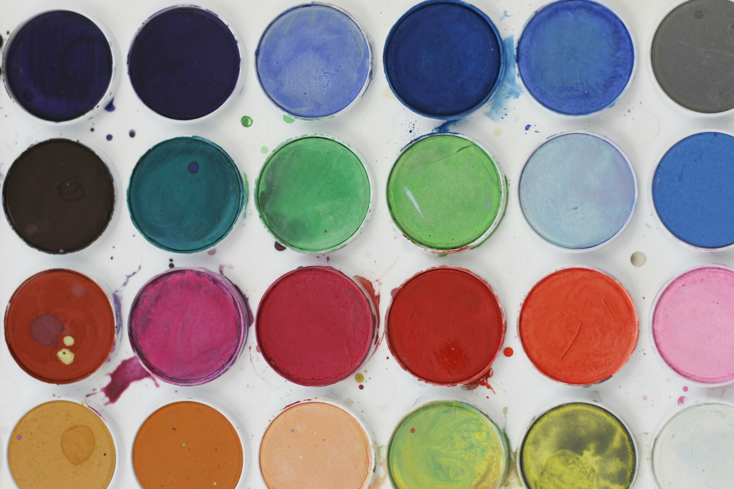
High-converting palette patterns (with examples you can copy)
There is no universal “best” color, but there are repeatable patterns that tend to convert because they reduce ambiguity. Start with the category norms, then differentiate with a controlled twist. For example, fintech often leans blue for trust; a neon accent can still work, but only if the typography and spacing keep the page feeling stable.
Here are practical palette patterns and when to use them:
| Pattern | Best for | How it increases conversions | Quick implementation tip |
|---|---|---|---|
| Neutral base + bold CTA accent | Direct response landing pages | Makes the primary action visually dominant | Reserve the accent color for buttons and key links only |
| Monochrome brand + contrast CTA | Brands with strong identity | Builds recognition while keeping actions clear | Use 2 to 3 tints of the brand color for hierarchy |
| Warm palette + clean whitespace | Beauty, food, lifestyle | Feels human and inviting without clutter | Keep text dark and backgrounds light to preserve readability |
| Dark mode premium + metallic accent | Luxury, tech hardware | Signals exclusivity and higher perceived value | Use one bright accent for price and CTA, not for body text |
Concrete takeaway: choose one pattern for your landing page and one for creator templates, then lock them into a simple style guide so every new asset starts consistent.
CTA color rules that hold up in tests
CTA color is not about “red vs green.” It is about contrast, consistency, and expectation. Contrast ensures the button is discoverable. Consistency teaches users what is clickable. Expectation means the CTA looks like a button, not a decorative badge.
Use these CTA rules before you run any A/B test:
- Contrast ratio: ensure text is readable and the button stands out from the background. If you need a standard, follow the WCAG contrast guidance from the W3C Web Content Accessibility Guidelines.
- One primary CTA per screen: secondary actions should be neutral (outline or muted fill).
- Keep CTA color stable across the funnel: if your “Buy” button is green on the landing page, do not make it blue in checkout.
- Match urgency to category: aggressive reds can lift clicks for discounts but reduce trust for healthcare or finance.
Example calculation: suppose your landing page gets 50,000 sessions from creator links. Version A (current) has a 2.0% click-to-checkout rate and 30% checkout completion. That yields 50,000 x 0.02 x 0.30 = 300 purchases. If a higher-contrast CTA lifts click-to-checkout to 2.3% with the same completion rate, purchases become 50,000 x 0.023 x 0.30 = 345 purchases, a 15% lift without changing traffic.
Concrete takeaway: do not judge CTA color on click rate alone. Track the full path to purchase so you do not optimize for curiosity clicks that do not convert.
Influencer creative: how to brief creators on color without killing authenticity
Creators do not want rigid brand rules, and you do not want off-brand visuals that confuse buyers. The solution is to brief color as guardrails tied to outcomes. Give creators a small set of “must keep” elements and let them choose how to integrate them in their style.
Include these items in your creator brief:
- Brand palette: 1 primary, 1 secondary, 1 CTA accent, plus hex codes.
- Do not use list: colors that clash with your product (for example, neon green backgrounds that distort skincare tones).
- Text overlay rules: approved high-contrast combinations and minimum font weight.
- Product color accuracy: guidance on lighting temperature so the product shade matches reality.
- CTA placement: where the accent color should appear (button sticker, link prompt, end card).
If you run whitelisting, color consistency becomes even more important because paid distribution amplifies small creative flaws. Also, usage rights should specify whether you can recolor overlays or add brand frames when repurposing content for ads. If you need a practical library of campaign planning and creator operations tips, browse the InfluencerDB Blog and adapt the frameworks to your briefs.
Concrete takeaway: provide creators with two template options – a light background version and a dark background version – so they can pick what fits their filming setup while staying on brand.
A testing framework: isolate color variables and measure impact
Color changes are easy to test, but they are also easy to test badly. If you change the CTA color, headline, and hero image at the same time, you will not know what caused the lift. Instead, isolate one variable per test and run it long enough to beat noise.
Use this step-by-step method:
- Pick one conversion event: add to cart, checkout start, purchase, email signup.
- Choose one color variable: CTA fill, background tint, link color, badge color, or overlay color in creator ads.
- Define the hypothesis: “Higher contrast CTA increases checkout starts.”
- Set guardrail metrics: bounce rate, time on page, refund rate, or lead quality.
- Run an A/B test: keep everything else identical, including copy and layout.
- Segment results: new vs returning users, mobile vs desktop, paid vs creator traffic.
- Document and standardize: update your style guide and creator templates.
For influencer campaigns, measure color impact at two layers: creative performance (thumbstop rate, view-through, click-through) and on-site performance (conversion rate, AOV, CPA). If you are using platform ads, make sure your measurement setup is correct. Meta’s documentation on conversion tracking and events is a solid reference: Meta Pixel and Conversions API overview.
Concrete takeaway: if you cannot run a clean A/B test, use a “paired creative” approach – two creator ads with identical scripts and framing, changing only the overlay color and CTA treatment.
Common mistakes that quietly lower conversion rates
Most color problems are not dramatic. They are small inconsistencies that add friction, especially on mobile. Fixing them often produces a measurable lift because you remove confusion at the exact moment users decide whether to trust you.
- Using too many accent colors: every badge, icon, and underline competes with the CTA.
- Low contrast text overlays in creator videos: viewers miss the key claim, then scroll.
- Color meaning mismatch: “medical blue” for a playful candy brand, or aggressive red for a high-trust service.
- Inconsistent CTA color across pages: users hesitate because the interface feels unfamiliar.
- Ignoring color blindness: relying on red vs green alone to communicate status or choices.
Concrete takeaway: do a five-second test. Show someone your landing page for five seconds, then ask them what the product is and where they would click. If they cannot answer both, your hierarchy and contrast need work.
Best practices: a conversion-first color checklist
Once you have the basics right, you can push for incremental gains without breaking brand consistency. The best teams treat color like a performance lever and a brand asset at the same time. That balance is especially important when you scale creator partnerships, because every new creator adds variation.
| Area | Best practice | Why it works | What to do next |
|---|---|---|---|
| CTA system | One reserved accent color for primary actions | Builds learned behavior and reduces decision time | Update buttons, links, and sticky bars to match |
| Typography and overlays | High contrast text with consistent overlay styles | Improves comprehension in fast-scrolling feeds | Create two overlay presets for creators |
| Product accuracy | Standard lighting guidance for creators | Reduces returns and “not as pictured” complaints | Provide a simple lighting one-pager in briefs |
| Testing discipline | Change one color variable per experiment | Lets you attribute lift and build a playbook | Log tests with hypothesis and results |
| Accessibility | Do not rely on color alone to convey meaning | Protects usability across devices and audiences | Add icons, labels, and clear states |
Concrete takeaway: treat your palette like a product feature. Version it, document it, and roll out changes intentionally across landing pages, creator templates, and paid ads.
Putting it all together: a simple workflow for your next campaign
To turn color into a conversion lever, you need a workflow that connects creative choices to measurable outcomes. Start by auditing your current funnel and creator assets for contrast and consistency. Next, choose a palette pattern that fits your category and brand position, then define a reserved CTA accent. After that, update your creator brief with guardrails and templates so the feed content and landing page feel like one coherent experience.
Finally, run a controlled test and calculate impact using the metrics you already track. If you spent $12,000 on whitelisted creator ads and drove 400 purchases, your CPA is $12,000 / 400 = $30. If a color change improves conversion rate enough to generate 460 purchases at the same spend, CPA becomes $12,000 / 460 = about $26.09. That is a real margin win created by design discipline, not more budget.
Concrete takeaway: pick one high-traffic page and one high-spend creator ad set, then run a two-week color experiment with a single variable. Document the result and bake the winner into your templates.