High Converting Landing Pages are built by matching one promise to one audience, then removing every point of friction between click and conversion. In influencer marketing and paid social, that matters because your traffic is expensive, variable, and often mobile-first. A great creator can deliver attention, but the landing page decides whether that attention becomes revenue, leads, or installs. So instead of guessing, you need a repeatable system: message match, clear hierarchy, proof, and measurement. This guide breaks that system into practical steps you can apply today.
High Converting Landing Pages start with message match
Before you touch design, lock the promise that brought the visitor here. Message match means the landing page headline and first screen repeat the same outcome, audience, and offer the user saw in the ad, creator story, or email. If a TikTok says “30-day skin reset for hormonal acne,” your page cannot open with a generic “Shop our bestsellers.” That mismatch creates doubt, and doubt kills conversions. As a rule, keep one traffic source per page when possible, or use dynamic text replacement to swap headline and hero copy by UTM. Takeaway: write the ad or creator script first, then mirror its core claim in the page headline and hero subhead.
Define the metrics and terms you will use (so you can improve them)

Landing pages sit inside a performance system, so define the numbers early and keep them consistent across teams. CPM is cost per thousand impressions, and it tells you how expensive it is to get attention. CPV is cost per view, common for video placements, and it helps you compare creator whitelisting ads to platform video ads. CPA is cost per acquisition – the amount you pay for one conversion (purchase, lead, signup, install). Engagement rate is engagements divided by reach or impressions (be explicit which one), and it helps you judge whether creator content is resonating. Reach is the number of unique people who saw the content, while impressions count total views including repeats. Whitelisting is when a brand runs ads through a creator’s handle, often improving click-through rate because the ad feels native. Usage rights define how long and where you can reuse creator content, while exclusivity restricts the creator from working with competitors for a period of time. Takeaway: document these definitions in your campaign brief so your landing page tests tie back to the same CPA goal.
Build the page around one conversion goal and one primary action
High conversion rates come from focus. Decide whether the page is meant to sell, capture leads, book a call, or drive an app install, then design everything around that single action. When you add secondary CTAs like “Learn more,” “Browse all,” and “Follow us,” you create exits that compete with the main goal. If you truly need multiple paths, use a two-step approach: first ask a qualifying question, then route to the right next step. For ecommerce, the primary action is usually “Add to cart” or “Buy now,” while for services it may be “Book a demo.” Takeaway: audit your hero section and remove any link that does not support the primary action.
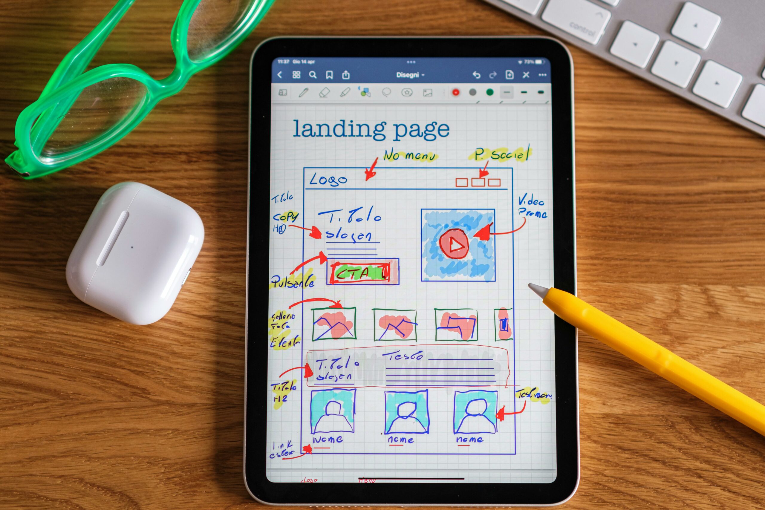
Use a proven above-the-fold layout (mobile first)
Most influencer traffic lands on mobile, often with low patience and high curiosity. Your first screen should answer four questions fast: What is it, who is it for, why should I trust you, and what do I do next. A practical layout is: headline with outcome, subhead with mechanism or differentiator, one hero visual that shows the product in use, and a single CTA button. Add a small trust line under the CTA like “Free returns” or “Cancel anytime” to reduce risk. Keep the CTA visible without scrolling on common devices, and avoid tiny text that forces pinch-zoom. Takeaway: open your page on a phone and count how many seconds it takes to understand the offer; if it is more than five, rewrite the hero.
Copy that converts: clarity beats cleverness
Landing page copy should read like a good creator script: specific, concrete, and easy to repeat. Start with a headline that states the outcome, not the product category. Then use a subhead that explains how it works or why it is different. For body copy, use short sections with bolded lead-ins, because mobile readers scan. A simple formula that works across niches is PAS: Problem, Agitation, Solution. Another is “Outcome – Timeframe – Proof,” such as “Whiter teeth in 7 days, backed by dentist-formulated gel.” If you want a deeper copy framework for performance campaigns, you can also browse the InfluencerDB blog guides on campaign strategy and optimization and adapt the same clarity principles to landing pages. Takeaway: remove adjectives that do not add meaning and replace them with numbers, timeframes, or specific mechanisms.
Proof, risk reversal, and objections: the conversion triad
Once your promise is clear, visitors ask two silent questions: “Is this real?” and “What if it does not work for me?” Proof answers the first, risk reversal answers the second, and objection handling reduces hesitation. Proof can include reviews, before-and-after photos, third-party mentions, creator testimonials, or quantified results. Risk reversal includes free shipping thresholds, money-back guarantees, trial periods, and transparent return policies. Objection handling is best done with short FAQ blocks placed near the CTA and again near the bottom, covering shipping time, sizing, ingredients, compatibility, and cancellation. Takeaway: list your top five support tickets or DMs and turn them into an FAQ section with direct answers.
Influencer traffic specifics: align the page to creator intent
Creator audiences arrive with context. They often know why they clicked because the creator told them, and they expect continuity. Use the creator’s language in a dedicated section like “Why this works” and mirror the exact benefit they highlighted. If you run whitelisted ads, consider a creator-specific landing page variant that includes the creator clip, a quote, or a curated bundle. Also, be careful with discount codes: if the creator promised “Use code MAYA for 15%,” the code should be pre-applied or extremely easy to apply, otherwise you create frustration. Takeaway: create a template for creator-specific pages that swaps three elements only – headline, proof block, and offer – so you can scale without reinventing the whole page.
Tracking and measurement: connect page changes to CPA
You cannot optimize what you cannot measure. At minimum, track page view, view content, add to cart, initiate checkout, and purchase or lead. Use UTMs consistently so you can compare creators, ads, and placements. A basic CPA formula is: CPA = total spend / number of conversions. If you are comparing two landing page variants, focus on conversion rate and revenue per visitor, not just clicks. For measurement standards and attribution basics, Google’s official analytics documentation is a reliable reference: Google Analytics measurement overview. Takeaway: set up one dashboard that shows sessions, conversion rate, and CPA by UTM campaign so landing page tests have a clear scorecard.
Landing page audit checklist (fast, repeatable)
Use this checklist before you send traffic, especially from creators where timing matters. First, confirm message match: ad claim, headline, and hero image align. Next, check speed: if the page takes more than a few seconds on mobile, you are paying for bounce. Then verify the CTA: one primary action, consistent button labels, and no distracting links. After that, review proof: at least one strong proof element above the first major scroll. Finally, confirm tracking: pixels firing, UTMs present, and conversion events recorded. Takeaway: run this audit the day before a creator post goes live so you can fix issues without wasting peak traffic.
| Audit area | What to check | Pass criteria | Quick fix |
|---|---|---|---|
| Message match | Headline, hero, offer vs. ad or creator script | Same outcome and audience language | Rewrite headline and subhead to mirror the ad |
| CTA focus | Buttons, links, nav, footer clutter | One primary CTA, no top navigation | Remove nav, reduce links, keep one button style |
| Trust | Reviews, guarantees, policies, security | Proof visible before deep scroll | Add review snippet and guarantee near CTA |
| Speed | Mobile load time, image weight, scripts | Fast enough to keep scroll momentum | Compress images, defer noncritical scripts |
| Tracking | Events, UTMs, thank-you page | Conversions recorded reliably | Test events in preview mode and fix missing tags |
Testing framework: what to test first (and why)
Testing works when you prioritize high-impact changes and keep hypotheses tight. Start with the hero because it affects every visitor. Then test offer framing, proof strength, and friction reducers like shipping thresholds or form length. Keep one variable per test when possible, and run tests long enough to avoid day-of-week noise. If you do not have enough traffic for classic A/B testing, use sequential testing: run Variant A for a fixed period, then Variant B for the same period, while keeping spend and targeting stable. Takeaway: write each test as “If we change X for audience Y, then metric Z will improve because reason R.”
| Test priority | Element | Hypothesis example | Primary metric | When to use |
|---|---|---|---|---|
| 1 | Headline and subhead | Outcome-first headline will increase purchases by reducing confusion | Conversion rate | High bounce, low scroll depth |
| 2 | Hero creative | In-use photo will increase add to cart by showing real scale and context | Add to cart rate | Product needs demonstration |
| 3 | Offer and pricing | Bundle option will raise revenue per visitor by increasing AOV | Revenue per visitor | Strong intent, low AOV |
| 4 | Social proof | Adding verified reviews will increase checkout starts by building trust | Initiate checkout rate | New brand, low trust |
| 5 | Friction reducers | Shorter form will increase lead submits by lowering effort | Lead submit rate | Lead gen pages |
Simple formulas and example calculations (so decisions are obvious)
Use a few basic calculations to decide whether to fix the page, change the offer, or adjust traffic. Conversion rate (CVR) = conversions / sessions. Revenue per visitor (RPV) = revenue / sessions. If you pay for traffic, you also want break-even CPA: break-even CPA = gross profit per order x conversion rate from click to purchase is not the right framing; instead use break-even cost per click (CPC) = gross profit per visitor, where gross profit per visitor = gross profit per order x CVR. Example: your gross profit per order is $40 and CVR is 2%. Gross profit per visitor is $40 x 0.02 = $0.80, so your break-even CPC is $0.80. If your influencer whitelisting ads are driving $1.20 CPC, you either need higher CVR, higher profit per order, or cheaper clicks. Takeaway: calculate gross profit per visitor before you scale spend, because it tells you what the page must achieve.
Common mistakes (and how to fix them fast)
The most common mistake is sending mixed traffic to a generic homepage. Fix it by building a dedicated landing page per offer and audience, even if the page is simple. Another frequent issue is burying the price or shipping details until late, which creates surprise and drop-off; instead, be transparent early and use a risk reducer. Many teams also overload the page with features and forget the outcome; rewrite sections so each feature maps to a benefit the visitor cares about. Finally, brands often forget mobile QA and end up with tiny buttons, broken carousels, or slow scripts. Takeaway: schedule a 10-minute mobile QA before every big creator drop and treat it like a launch requirement.
Best practices you can apply on your next build
Start with a single, specific promise and repeat it across the ad, the landing page hero, and the CTA. Use one strong visual that demonstrates the product in context, not a collage of small images. Add proof early, and make it credible with details like verified reviews, numbers, and clear sourcing. Reduce risk with a guarantee and clear policies, and place those details near the CTA where hesitation happens. For compliance, make sure endorsements and testimonials are not misleading and that disclosures are clear when needed; the FTC’s guidance is the safest baseline: FTC endorsements and reviews guidance. Takeaway: treat the landing page as part of the ad, not a separate asset, and keep it aligned with what the visitor was promised.
A practical build plan for teams (from brief to launch)
To ship consistently, use a simple workflow. First, write a one-page brief: audience, promise, offer, proof assets, and primary CTA. Next, draft the hero section and one proof block before you design the rest, because those elements drive most results. Then build the page with reusable sections: hero, benefits, proof, FAQ, and final CTA. After that, set up tracking and test events, including a full conversion test from click to thank-you page. Finally, launch with a single test in mind, not ten changes at once, so you can learn quickly. Takeaway: if you cannot describe the page’s promise in one sentence, the page is not ready for paid or influencer traffic.