High converting landing pages are the difference between paying for attention and earning revenue, leads, or signups you can measure. If you run influencer campaigns, creator partnerships, or paid social, your landing page is where the promise made in the post either becomes a conversion or collapses into a bounce. The good news is that conversion rate is not magic – it is a set of controllable choices: message match, friction, trust, and a clear next step. In this guide, you will get a practical build checklist, copy frameworks, tracking setup, and testing rules you can apply in a single afternoon. You will also see examples and simple formulas so you can forecast results before you spend.
What makes high converting landing pages work
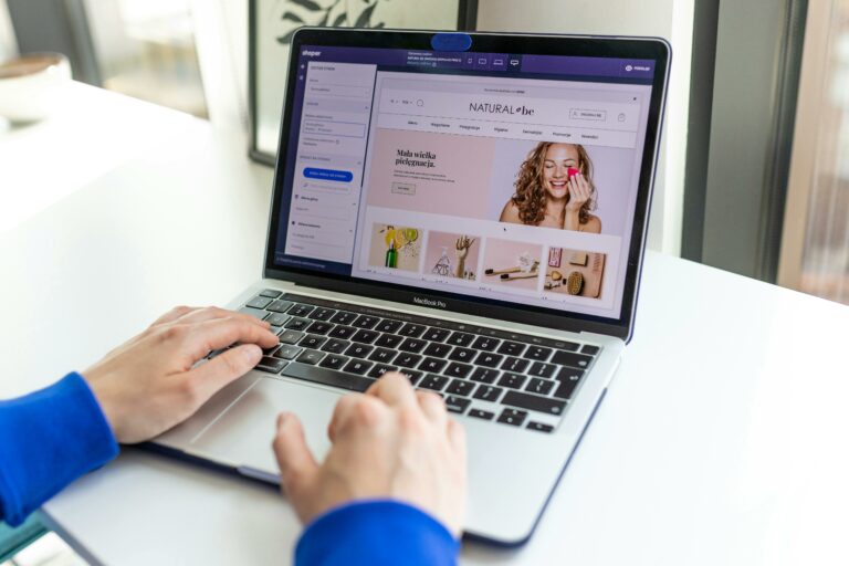
A landing page is a focused page built for one action, such as buying, booking, downloading, or joining a waitlist. Unlike a homepage, it removes competing navigation and keeps the visitor on one path. For influencer traffic, that focus matters because visitors arrive with high intent but limited patience. First, your page must deliver message match – the headline and hero should repeat the same offer and language used in the creator content. Next, it must reduce friction – fewer fields, fewer steps, and faster load times. Finally, it needs trust – proof, policies, and clarity that reduce perceived risk. Takeaway: before you touch design, write the one sentence promise from the ad or creator post and make it your headline draft.
Define the metrics you will use so you do not optimize blindly. Reach is the estimated number of unique people who saw content, while impressions count total views including repeats. Engagement rate is typically engagements divided by impressions or reach, depending on platform reporting; choose one definition and stick to it for comparisons. CPM is cost per thousand impressions, CPV is cost per view (often video views), and CPA is cost per acquisition, meaning cost per conversion you care about. In landing page terms, your key metric is conversion rate: conversions divided by sessions. A simple forecasting formula helps: Expected conversions = sessions x conversion rate. If a creator drives 2,000 sessions and you convert at 3%, you should expect about 60 conversions.
Landing page goals and KPIs for influencer traffic

Influencer clicks behave differently from search clicks. People arrive because they trust a person, not because they researched a category, so your page must quickly connect the creator story to the product outcome. Start by choosing one primary goal per page: purchase, lead, app install, or booking. Then pick supporting KPIs that explain performance: scroll depth, time on page, click through on the CTA, and form completion rate. If you are running multiple creators, you also need a consistent measurement plan so you can compare partners fairly. A practical rule: if your CTA click rate is strong but conversion is weak, the problem is usually the offer or the checkout flow; if CTA click rate is weak, the problem is usually the hero section and message match.
Creator campaigns also introduce terms that affect landing page economics. Whitelisting means running paid ads through a creator handle, which can increase trust but also changes audience targeting and frequency. Usage rights define how long and where you can reuse creator content, which affects how long your landing page needs to stay aligned with that creative. Exclusivity is the agreement that a creator will not promote competitors for a period, which can raise fees but also reduce audience confusion. Takeaway: document whitelisting, usage rights, and exclusivity in the same campaign brief as your landing page URL so the page stays consistent with the creative you are allowed to run.
A step by step build checklist for high converting landing pages
Build the page in a deliberate order so you do not waste time polishing the wrong thing. Step 1: write the offer in plain language, including who it is for, what they get, and what happens next. Step 2: draft a hero section with a headline, subhead, one primary CTA, and a supporting visual that shows the product in use. Step 3: add three benefit blocks that translate features into outcomes, ideally using the same phrases creators use. Step 4: place proof near the first CTA, such as ratings, testimonials, press mentions, or creator quotes you have rights to use. Step 5: add an FAQ that answers objections that show up in comments and DMs. Step 6: end with a final CTA and a risk reducer like a guarantee, free returns, or a clear cancellation policy.
Use this on page checklist before you publish:
- Message match: headline repeats the creator hook or ad promise.
- Single goal: one primary CTA and no competing navigation.
- Speed: compressed images, minimal scripts, and fast mobile rendering.
- Trust: proof, policies, and contact method visible without hunting.
- Friction: form fields only ask what you truly need right now.
- Accessibility: readable font sizes, contrast, and clear labels.
When you need inspiration for campaign structure and measurement, browse the InfluencerDB blog guides on influencer strategy and analytics and map the same discipline to your landing page plan. The key is consistency: the best creator content cannot rescue a confusing page.
Copy and layout formulas that increase conversions
Landing page copy should sound like the customer, not the brand. Start with a headline formula that forces clarity: Outcome + timeframe or mechanism + audience. Example: “Clearer skin in 14 days with a routine built for sensitive skin.” Follow with a subhead that removes ambiguity about what the visitor gets, such as “Take the 2 minute quiz and get a personalized routine.” Keep your first screen tight: one headline, one subhead, one CTA, and one supporting line that reduces risk. If you add a second CTA, make it a softer option like “See ingredients” or “Watch how it works,” not a competing conversion path.
For benefit sections, use the “So you can” pattern to translate features into outcomes. Instead of “10% vitamin C,” write “10% vitamin C – so you can fade dark spots without a complicated routine.” For influencer traffic, include a short creator aligned paragraph that mirrors the content format, such as “Why creators like this” followed by three bullets. Keep paragraphs readable on mobile by limiting lines and using subheads. Takeaway: if a sentence does not help the visitor decide, cut it.
Trust elements matter more than most teams admit. Add proof that matches the risk: for expensive products, show guarantees and financing; for supplements, show third party testing and clear disclaimers; for subscriptions, show cancellation steps. You can reference general conversion principles from reputable sources like Nielsen Norman Group usability research to justify simplifying layouts and reducing cognitive load. Do not bury your policies in tiny footer links, because visitors interpret hidden details as risk.
Tracking and attribution for creator driven landing pages
If you cannot measure it, you cannot improve it. Start with clean URLs and consistent UTM parameters so each creator and placement is identifiable. A practical UTM pattern looks like this: utm_source=instagram, utm_medium=influencer, utm_campaign=summer_drop, utm_content=creatorname_story1. Next, set up events for the steps that matter: CTA clicks, add to cart, checkout start, and purchase or lead submit. If you use Google Analytics, follow the official measurement guidance to keep your implementation consistent across pages and channels: Google Analytics event documentation.
For influencer campaigns, you will often compare code based attribution with click based attribution. Codes capture purchases that happen without a click, but they can be shared and may over credit. UTMs capture clicks, but they miss view through behavior and cross device journeys. A balanced approach is to use both and report a range. Takeaway: create a simple reporting table that shows sessions, conversion rate, and revenue by creator URL, then add code redemptions as a separate column rather than mixing them into one number.
Here is a simple way to calculate CPA and ROI from a landing page test:
- CPA = total spend / conversions
- Revenue per session = total revenue / sessions
- ROAS = revenue / spend
Example: you spend $3,000 on a whitelisted creator ad that drives 5,000 sessions. If conversion rate is 2.5%, you get 125 conversions. Your CPA is $3,000 / 125 = $24. If average order value is $60, revenue is $7,500 and ROAS is 2.5. From there, you can decide whether to scale, improve the page, or renegotiate pricing.
Testing plan: what to A B test first and why
Testing works when you change one meaningful variable at a time and you run the test long enough to avoid noise. Start with high impact elements above the fold: headline, primary CTA text, hero image, and offer framing. Then move to friction reducers like form length, shipping thresholds, and payment options. Avoid testing tiny button colors unless you already fixed the big issues. A decision rule that keeps teams honest: if a change does not plausibly move conversion rate by at least 10% relative, do not spend time testing it yet.
Use a simple test brief for each experiment:
- Hypothesis: what you believe and why.
- Change: the exact element you will edit.
- Primary metric: conversion rate or lead submit rate.
- Guardrail metrics: bounce rate, AOV, refund rate.
- Audience: which creators or channels feed the page.
- Duration: minimum days and minimum sessions.
Takeaway: when influencer traffic is spiky, run tests by session thresholds, not by calendar days. For example, require 1,000 sessions per variant before calling a result, and pause tests during major promo blasts that change intent.
Two practical tables you can reuse
The first table helps you choose the right page type based on campaign objective. It also clarifies what you should measure so you do not judge a lead page like a product page.
| Campaign goal | Best landing page type | Primary CTA | Core proof to include | Primary KPI |
|---|---|---|---|---|
| Direct sales | Product offer page | Buy now | Reviews, returns policy, shipping clarity | Purchase conversion rate |
| Lead capture | Lead magnet page | Get the guide | Preview, credibility, privacy note | Lead submit rate |
| Waitlist | Launch waitlist page | Join the waitlist | Social proof, timeline, what happens next | Signup rate |
| App installs | App pre sell page | Download | Screenshots, ratings, short demo video | Install rate |
| Bookings | Service booking page | Book a call | Case studies, credentials, availability | Booked appointments |
The second table is a build and QA checklist you can assign across a team. It prevents last minute launches where tracking or mobile layout breaks and nobody owns the fix.
| Phase | Task | Owner | Definition of done |
|---|---|---|---|
| Planning | Write one sentence offer and audience | Marketing lead | Offer statement approved and shared with creators |
| Build | Create hero section with one CTA | Designer | Mobile first layout, no competing links |
| Copy | Draft benefits and FAQ from comments | Copywriter | FAQ answers top 5 objections in plain language |
| Trust | Add proof and policies near CTA | Brand manager | Reviews, guarantee, shipping and returns visible |
| Tracking | UTMs and events for key steps | Analyst | Events firing correctly in analytics |
| QA | Test on 3 devices and 2 browsers | Project manager | No layout bugs, forms work, page loads fast |
| Launch | Creator specific links and codes distributed | Partnerships lead | Each creator has a unique URL and code |
Common mistakes that quietly kill conversions
Many landing pages fail for predictable reasons. The most common is weak message match: the creator promises one outcome, but the page opens with generic branding. Another frequent issue is too many CTAs, which splits attention and lowers completion rates. Slow load time is also a silent killer, especially for story swipe ups where users are on mobile data. Teams also forget to show total cost early, so shipping or fees appear late and trigger abandonment. Takeaway: review your page like a skeptical customer and list every moment you feel uncertainty, then fix those moments first.
Best practices you can apply today
Start by building one dedicated page per offer and per audience segment, not one page for everything. Next, create creator specific versions when the hook is meaningfully different, such as “protein for runners” versus “protein for busy parents.” Keep the page short until you need length; add detail only when it answers objections. Use a sticky CTA on mobile if your product requires scrolling to understand, but keep it unobtrusive. Finally, run a weekly review where you compare creators by sessions, conversion rate, and revenue per session, then feed the insights back into briefs and creative. Takeaway: treat the landing page as part of the creator content, not a separate asset, because the best results come from a single coherent story.