Landing page types are not just design variations – they are decision tools that help you match a visitor’s intent to one clear next step. In 2026, the best-performing pages tend to be simpler, faster, and more specific, because traffic is more fragmented and attention is tighter. That means your job is less about making a page look “delicious” and more about making it feel inevitable: the offer, proof, and CTA all align. To do that, you need a menu of page patterns you can deploy on purpose, not by habit. This guide breaks down the most useful landing page formats, when to use each, and how to measure whether it is working.
Start with the basics: key terms you must define before you build
Before you pick a layout, define the metrics and deal terms you will use to judge success, especially if you run influencer or paid social traffic. Reach is the number of unique people who saw your content, while impressions count total views including repeats. Engagement rate is typically engagements divided by impressions or followers – pick one definition and stick to it across reports. CPM is cost per thousand impressions (spend divided by impressions times 1,000), CPV is cost per view (common for video), and CPA is cost per acquisition (spend divided by conversions). If you work with creators, whitelisting means running ads through a creator’s handle, which can change click behavior and trust. Usage rights define where and how long you can reuse creator content, and exclusivity defines what competitors the creator cannot work with during a period. These terms matter because the “right” landing page type depends on whether you are optimizing for low-friction leads, high-intent purchases, or measurable post-click actions.
| Term | What it measures | Simple formula | Where it shows up |
|---|---|---|---|
| CPM | Cost efficiency for impressions | (Spend / Impressions) x 1000 | Paid social, whitelisted ads |
| CPV | Cost efficiency for video views | Spend / Views | TikTok, Reels, YouTube |
| CPA | Cost per conversion | Spend / Conversions | Lead gen, ecommerce, trials |
| Engagement rate | Content resonance | Engagements / Impressions (or Followers) | Creator evaluation, creative testing |
| Reach | Unique exposure | Platform reported | Awareness campaigns |
| Impressions | Total exposures | Platform reported | Frequency management |
Landing page types by goal: a 3-step selection framework

Choosing between landing page types gets easier when you stop thinking in templates and start thinking in constraints. Use this three-step method to pick a page that fits the traffic you are paying for or earning. Step 1: name the visitor’s intent in one sentence, such as “I want proof this works” or “I want to compare options quickly.” Step 2: choose the primary conversion event you can track cleanly, like purchase, booked call, email capture, or app install. Step 3: remove everything that does not support that event, including extra navigation, secondary CTAs, and long detours to other pages. As a practical rule, the colder the traffic, the more your page must lead with clarity and proof; the warmer the traffic, the more you can lead with specifics like pricing and implementation details.
Here is a quick way to sanity-check the match between traffic and page. If you are sending influencer traffic from a short-form video, the visitor arrives with borrowed trust but limited context, so a page with fast social proof and a single CTA usually wins. If you are sending search traffic, the visitor arrives with intent and questions, so a comparison or problem-solution page can outperform a minimal squeeze page. For measurement, make sure you implement consistent event tracking; Google’s guidance on tagging and measurement is a solid baseline for teams that need cleaner attribution across channels: Google Analytics measurement overview.
Product detail landing page: best for direct sales and high-intent clicks
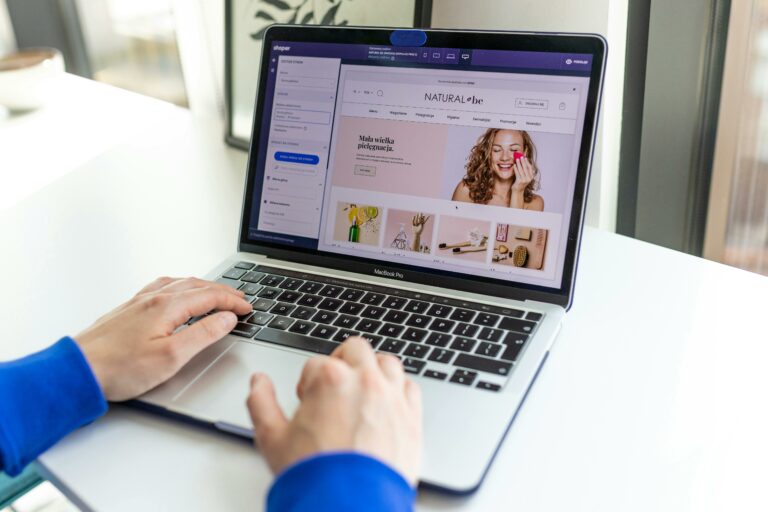
A product detail landing page is the ecommerce-style format built to close, even if it lives outside your main store. Use it when you have high-intent traffic, clear pricing, and a product that can be understood quickly with visuals and benefits. The core sections should be: hero with value proposition, price and offer, benefit bullets, proof, FAQs, and a sticky CTA. Keep your copy specific: name the outcome, the time frame, and the constraints, instead of vague promises. As a takeaway, if you can’t explain the product in one sentence and three bullets, you are not ready for this page type.
For creators and influencer campaigns, this page works best when you mirror the language used in the content that drove the click. If a creator frames your product as “the easiest way to do X in 10 minutes,” put that phrasing in the hero and reinforce it with a short demo video. Add a “what’s included” module to reduce buyer anxiety, and show shipping, returns, and warranty details above the fold on mobile. Finally, run a simple A/B test on the offer framing: percent off vs. bundle vs. free shipping, but only change one variable at a time.
Lead capture landing page: best for email, waitlists, and B2B inquiries
A lead capture page trades value for contact information, so your offer must be concrete and your form must feel safe. Use it for newsletters, free tools, webinars, waitlists, and B2B demos where the sale happens later. Keep the form short, usually email plus one qualifier, and explain what happens next in plain language. Add trust signals near the form: privacy note, logos, or a short testimonial. A practical checklist: one promise, one form, one CTA, and one proof block – then stop.
When you buy traffic, lead pages can look good on CPM but fail on CPA if the lead quality is weak. Add one qualifying question that predicts fit, such as company size, budget range, or primary goal, and route leads accordingly. Example calculation: if you spend $1,200 and collect 80 leads, your CPA is $15. If only 10 leads become qualified and 2 close, your cost per qualified lead is $120 and your cost per customer is $600. Those numbers tell you whether to improve the page, tighten targeting, or change the offer.
Quiz or diagnostic landing page: best for personalization and higher conversion rates
Quiz pages work because they replace generic persuasion with a personalized path. Use them when your audience has different needs, when your product has multiple use cases, or when you want to segment leads for better follow-up. Keep the quiz short, usually 5 to 8 questions, and show progress so people finish. The result should be actionable, not a vague label, and it should naturally lead to your product or a tailored resource. As a rule, if you cannot map each answer to a meaningful next step, do not build a quiz yet.
To make this page type measurable, track quiz starts, completions, and result-page CTA clicks as separate events. Then you can see where drop-off happens and fix the exact step. Also, write your questions in the language your audience uses, not internal jargon. If you are sourcing traffic from creators, ask them to share the quiz result they got, because it sets expectations and improves completion rates.
Comparison landing page: best for “which one should I choose” intent
Comparison pages are built for visitors who are already shopping and want decision support. Use them for “Plan A vs Plan B,” “DIY vs done-for-you,” or “Our product vs alternatives” positioning. The page should lead with a clear recommendation for each segment, not just a neutral table. Include a comparison table, a short narrative explaining trade-offs, and FAQs that address the most common objections. Concrete takeaway: if you sell multiple tiers, write “choose this if” bullets for each tier, and place them above the pricing grid.
| Landing page type | Best for | Primary KPI | Must-have section | Common pitfall |
|---|---|---|---|---|
| Product detail | Direct sales | Conversion rate, AOV | Proof + FAQs | Too much text before the offer |
| Lead capture | Emails, demos | CPA, lead quality | Clear next step | Asking for too much info |
| Quiz | Segmentation | Completion rate | Actionable result | Results that feel generic |
| Comparison | Evaluation | CTA click rate | Decision table | Hiding the recommendation |
| Webinar | Education to sale | Registrations, attendance | Agenda + host credibility | Overpromising outcomes |
| App install | Mobile growth | Install rate, activation | Store badges + demo | Sending desktop users to app stores |
Webinar or event landing page: best for complex offers and trust-building
Webinar pages convert when they make the session feel specific, credible, and worth the time. Use this type when your product is complex, when you need to handle objections live, or when your best sales asset is education. The essentials are: a clear title, three to five learning outcomes, an agenda, speaker credibility, and a registration form that does not feel like a job application. Add time zones and calendar integration so people actually show up. As a practical step, write your webinar promise as “By the end, you will be able to…” and make sure the page supports that claim with proof.
If you use creators to promote the event, give them a short list of audience-fit angles and a single registration URL so tracking stays clean. Then measure registrations and attendance separately, because a cheap registration can be expensive if nobody attends. For example, if you spend $2,000 and get 200 registrations, CPA is $10. If only 40 attend, your cost per attendee is $50, which may still be great if your close rate is strong.
App install or mobile-first landing page: best for TikTok and mobile-heavy traffic
Mobile-first pages are built for speed, thumb-friendly layout, and instant clarity. Use them when most clicks come from TikTok, Reels, Shorts, or creator links, and when the next step is an app install or a mobile purchase. Keep the hero short, use a vertical demo video, and place the CTA within the first screen. If you need to support both iOS and Android, detect device type and show the correct store button. A concrete takeaway: test your page on a mid-range phone on cellular data, because that is closer to real user conditions than your office Wi-Fi.
Also, avoid sending desktop users to app stores without an alternative. Instead, show a QR code and an email-to-phone link. If you run paid social, align your landing page with platform policies and ad transparency expectations; Meta’s business help center is a reliable reference for ad and destination best practices: Meta Business Help Center.
Influencer campaign landing page: built for creator traffic, tracking, and reuse
This is the page type most brands underbuild, even though influencer traffic behaves differently from search or retargeting. An influencer campaign landing page is a dedicated destination that matches the creator’s narrative, removes distractions, and makes attribution easier. Start with a creator-aligned headline, then show three proof points that validate what the creator claimed. Add a simple offer module with a unique code, and include a short FAQ that addresses shipping, returns, and “will this work for me.” As a decision rule, if you are paying for usage rights or whitelisting, you should almost always use a dedicated page so you can iterate without touching your main site.
For measurement, use a clean structure: one URL per creator or per cohort, UTM parameters, and a consistent event set (view content, add to cart, purchase, lead). Then you can compare creators on CPA and conversion rate, not just clicks. If you want more practical guidance on tying creator performance to on-site outcomes, browse the analysis playbooks and measurement articles in the InfluencerDB blog, and adapt the tracking approach to your stack. Finally, document usage rights and exclusivity in your creator agreements so you can reuse the page creative safely across channels.
Common mistakes that make landing pages look good but convert poorly
First, teams often mix goals, such as asking for an email while also pushing a purchase, which splits attention and lowers both outcomes. Second, they over-explain above the fold, forcing visitors to work before they understand the offer. Third, they rely on generic social proof, like “trusted by thousands,” without specifics that match the visitor’s context. Fourth, they forget mobile ergonomics: tiny buttons, long forms, and slow video embeds quietly kill conversion rate. Fifth, they measure the wrong thing, celebrating low CPM while ignoring CPA, lead quality, or activation. Fixing these issues usually beats a full redesign, so audit them before you change your entire page.
Best practices: a practical checklist for 2026 performance
Start with message match: the headline should repeat the promise that earned the click, especially for creator traffic. Next, reduce friction by removing navigation, limiting form fields, and placing the primary CTA early and often, but not in a spammy way. Then, add proof that is hard to fake: short testimonials with specifics, before-and-after photos, or quantified outcomes with context. After that, improve speed by compressing images, lazy-loading noncritical assets, and keeping scripts minimal. Finally, run structured tests: change one element, set a minimum sample size, and record results so you do not repeat the same experiments next quarter. If you need a north star, focus on clarity first, proof second, and polish last – because clarity is what converts cold traffic.
Simple measurement and negotiation notes for influencer-driven landing pages
If you are buying creator posts, landing pages become part of your negotiation because they affect performance and reporting. Ask for deliverables that support the page type you chose: a short demo video for product detail pages, a story sequence for lead capture, or a pinned comment that frames the quiz. When discussing whitelisting, specify duration, platforms, and creative approvals, because the same creator content can perform differently once it becomes an ad. For usage rights, define where the content will appear, including on landing pages, and for how long. As a practical example, if you pay $3,000 for a creator package and spend $2,000 on whitelisted amplification, your total cost is $5,000; if the landing page produces 100 purchases, your blended CPA is $50, which you can compare to other channels.
To keep reporting honest, build a one-page scorecard: sessions, conversion rate, CPA, and revenue per session for each creator link. Add a note column for creative angle and landing page variant so you can learn what actually moved the needle. Over time, you will discover that some creators drive high click volume but low purchase intent, which is a signal to route them to a lead capture or quiz page instead of a direct product page. That is how you turn “delicious” landing pages into repeatable growth assets.