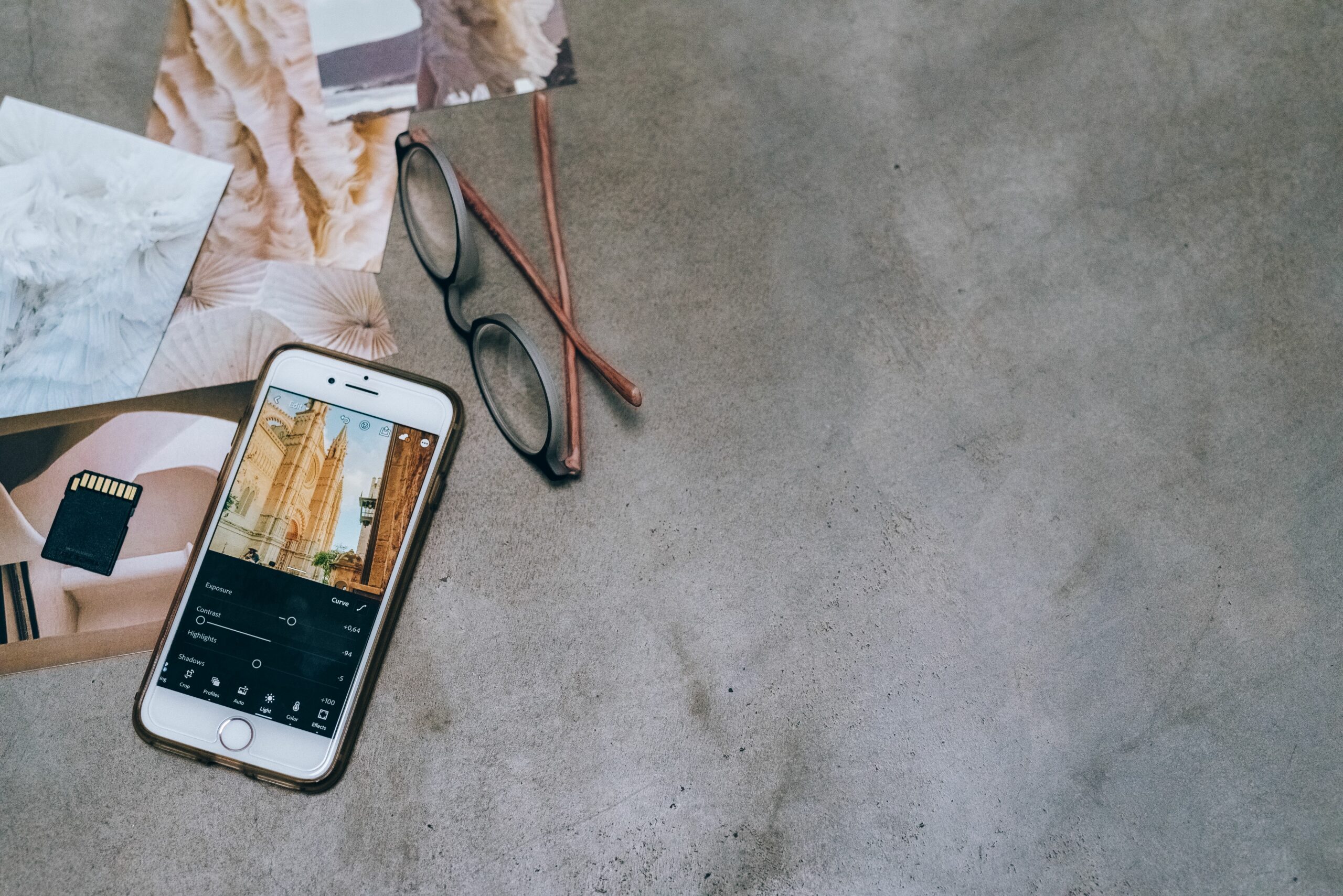

Photo editing apps are the fastest way to turn everyday mobile shots into scroll stopping content, and in 2025 the gap between phone edits and desktop work is smaller than ever. Still, the best app depends on what you publish, how fast you need to work, and whether you care more about color accuracy, skin retouching, templates, or AI tools. This guide breaks down the strongest Android and iOS options, plus a practical workflow you can reuse for brand work and your own feed. Along the way, you will get decision rules, export settings, and a few simple formulas to keep your content quality consistent across platforms.
What to look for in photo editing apps (2025 checklist)
Before you download anything, define what “good” means for your content. For creators and marketers, the goal is not endless tinkering, it is repeatable output that looks consistent on Instagram, TikTok covers, YouTube thumbnails, and brand landing pages. Start with this checklist and score each app from 1 to 5. Then pick one primary editor and one backup for quick fixes.
- Color control: curves, HSL, white balance, selective edits, and a histogram for exposure discipline.
- Speed: batch editing, copy paste settings, and presets that actually match your camera.
- Retouching: healing, blemish removal, face and body tools, and whether results look natural at 100 percent zoom.
- AI features: background removal, object erase, relight, and whether the app keeps edges clean on hair and product shots.
- Export options: JPEG quality control, PNG, HEIC support, and reliable sRGB output for social.
- Cross device workflow: cloud sync, consistent preset behavior, and easy handoff to a designer.
- Pricing clarity: what is free, what is paywalled, and whether a subscription is worth it for your volume.
Takeaway: If you publish daily, prioritize speed and batch tools. If you shoot products or beauty, prioritize color control and retouching quality. If you manage a brand account, prioritize consistency and export settings.
Photo editing apps comparison table: best Android and iOS picks
Most people waste time testing ten apps when they only need two. The table below summarizes common creator needs and which apps tend to fit best. Availability changes, but these are widely used across Android and iOS in 2025. Use it as a shortlist, not a final verdict, because your camera and style matter.
| App | Best for | Strengths | Watch outs | Ideal user |
|---|---|---|---|---|
| Adobe Lightroom Mobile | Color grading and consistency | Curves, HSL, presets, selective masks, good RAW support | Some features require subscription, learning curve | Creators who want a repeatable “look” across shoots |
| Snapseed | Fast, free edits | Solid tools, selective adjustments, healing, no subscription | Fewer modern AI tools, UI feels dated | Budget focused creators and community managers |
| VSCO | Film style presets | Strong preset library, simple workflow | Less precise control than Lightroom for advanced work | Lifestyle creators who value mood over micro tweaks |
| Photoshop Express | Quick fixes and composites | Retouching basics, text and overlays, one tap tools | Not as deep as full Photoshop, some paywalls | Creators making promos, thumbnails, and announcements |
| Canva | Templates and brand kits | Fast layouts, resizing, brand fonts, background removal (paid) | Not a true color grading tool, can look templated | Small teams shipping lots of social assets |
| CapCut Photo Editor tools | Social first edits | AI cutouts, trendy effects, easy integration with video workflow | Effects can date quickly, consistency can be harder | TikTok first creators who want speed |
Takeaway: Pick one “master” editor for color (often Lightroom) and one “production” tool for layouts (often Canva). That combo covers most creator and brand needs without chaos.
A practical mobile editing workflow for creators and brand teams
A good workflow reduces decision fatigue. It also makes your content look like it belongs to the same account, even when you shoot on different days or devices. Use this step by step system and you can train a teammate or a freelancer to match your style in a day.
- Start with a reference: pick 3 to 5 posts that represent your current look. Save them in an album called “Reference.”
- Correct first, stylize second: fix exposure and white balance before you touch presets. If skin looks gray or food looks neon, your white balance is off.
- Use a light touch on clarity and sharpening: over sharpening looks crunchy on phones. Zoom to 100 percent, then back out to fit screen.
- Apply a preset or saved settings: copy paste edits across a batch, then tweak per photo. This is where you save the most time.
- Retouch only what distracts: remove temporary blemishes, lint, or sensor dust. Avoid reshaping unless the brand explicitly requests it.
- Export with intent: choose settings based on where the image will live, not what looks best in your camera roll.
When you are building a creator program, consistency matters as much as creativity. If you need a broader system for planning and performance, keep an eye on the guides in the InfluencerDB Blog, especially when you are aligning content style with campaign KPIs.
Takeaway: The fastest path to better photos is not a new app, it is a repeatable order of operations: correct, match, retouch, export.
Export settings by platform: resolution, file type, and quality
Creators often blame an app for “ruining” quality when the real issue is export settings. Social platforms compress aggressively, and each one treats sharp edges and gradients differently. Start with these defaults, then adjust based on your niche. For example, product photos need cleaner edges than a casual selfie.
| Use case | Recommended size | File type | Quality setting | Notes |
|---|---|---|---|---|
| Instagram feed portrait | 1080 x 1350 | JPEG | 80 to 90 | Keep sRGB. Avoid heavy grain, it can band after compression. |
| Instagram Stories | 1080 x 1920 | JPEG or PNG | 80 to 90 | Use PNG for text heavy graphics to keep edges crisp. |
| TikTok cover image | 1080 x 1920 | JPEG | 80 to 90 | Leave safe margins for UI. Test on device before posting. |
| YouTube thumbnail | 1280 x 720 | JPEG | 90 | High contrast helps. Keep faces large and readable on mobile. |
| Brand website or email | 2000 px long edge | JPEG | 80 to 90 | Ask for specs. Some brands want PNG for cutouts. |
Takeaway: If you see muddy detail after posting, reduce noise reduction, avoid extreme clarity, and export at a slightly higher quality. Then re test with one image before you change your whole workflow.
Key terms creators should know (and how editing affects performance)
Editing is not just aesthetics, it can change performance metrics by improving clarity, brand recall, and click intent. To make data driven decisions, you need shared definitions. Here are the terms that show up in briefs, reports, and negotiations, plus how your images can influence them.
- Reach: unique accounts that saw your content. Cleaner thumbnails and consistent style can improve reach by boosting early engagement.
- Impressions: total views, including repeat views. Strong visuals can drive repeat viewing, especially on Stories and carousels.
- Engagement rate: engagements divided by reach or followers, depending on the report. A simple formula is ER by reach = (likes + comments + saves + shares) / reach.
- CPM: cost per thousand impressions. Formula: CPM = (cost / impressions) x 1000. Better creative can lower CPM by increasing impressions for the same spend in whitelisted ads.
- CPV: cost per view, common in video. Formula: CPV = cost / views. Strong cover images can lift views, which reduces CPV.
- CPA: cost per acquisition. Formula: CPA = cost / conversions. Product clarity and trust signals in images can improve conversion rate.
- Whitelisting: a brand runs ads through a creator’s handle. Clean, brand safe edits matter more because the content becomes paid media.
- Usage rights: permission for a brand to reuse your content. If a brand wants to crop, resize, or add text, export high quality files and keep a clean version without heavy effects.
- Exclusivity: limits on working with competitors for a period. If exclusivity is requested, your pricing should reflect the opportunity cost.
Example calculation: a brand pays $600 for a whitelisted post that generates 120,000 impressions. CPM = (600 / 120000) x 1000 = $5. If your improved cover and color grading lift impressions to 150,000 with the same spend, CPM drops to $4. That is a real performance gain tied to creative quality.
Takeaway: Treat editing as a lever in performance. When you can connect your visual choices to CPM, CPV, or CPA, you negotiate from evidence, not vibes.
How to choose the right app for your niche (decision rules)
Different niches punish different mistakes. Beauty audiences notice unnatural skin texture, while food audiences notice weird white balance. Use these decision rules to pick your primary editor, then set up presets or saved settings that match your niche.
- Beauty and skincare: prioritize natural retouching, accurate skin tones, and controlled highlights. Avoid aggressive smoothing that removes pores. Test edits under different screen brightness levels.
- Food and beverage: prioritize white balance and selective color. Greens and reds can clip fast, so use HSL gently. Keep shadows open so texture reads.
- Fashion: prioritize consistent color and fabric detail. Use curves for contrast rather than clarity sliders. Export slightly sharper for textile patterns.
- Travel: prioritize dynamic range and sky handling. Use masks for skies and foregrounds. Avoid over saturated blues that band after compression.
- Tech and product: prioritize edge cleanliness and accurate brand colors. Use background removal carefully and export PNG for graphics with text.
Also consider collaboration. If a brand asks for editable files, an app with cloud projects or easy file handoff matters. For official guidance on image formats and color spaces, Adobe’s photography resources can help you understand why sRGB is the safest default for web delivery: Adobe on color spaces.
Takeaway: Your niche determines your “failure mode.” Choose the app that prevents the mistakes your audience notices first.
Common mistakes that make mobile edits look cheap
Most bad edits are not subtle. They are patterns that repeat across accounts, and once you see them, you cannot unsee them. Fixing these mistakes will improve your content faster than any new filter pack.
- Over smoothing faces: it reads as AI or heavy retouching, which can hurt trust in beauty and wellness niches.
- Crushed blacks: deep shadows look “cinematic” in app previews but lose detail on social compression.
- Orange skin tones: often caused by warm presets stacked on top of warm indoor lighting. Correct white balance first.
- Over sharpening: halos around edges get worse after upload. Sharpen less than you think, then test post privately.
- Inconsistent series: a carousel where each image has a different temperature looks unprofessional. Copy paste settings, then tweak.
- Ignoring safe zones: text and faces get covered by UI on Stories and TikTok. Leave margins.
Takeaway: If you only fix one thing, stop stacking presets. One preset plus small manual corrections beats three effects fighting each other.
Best practices for creators delivering brand ready photos
Brands care about reliability. When you deliver clean files, clear usage terms, and consistent color, you become easy to rebook. These best practices also protect you when content gets repurposed in paid ads or on a product page.
- Deliver two versions: one “social” edit and one “clean” edit with lighter grading. The clean version gives brands flexibility.
- Confirm usage rights in writing: specify where the brand can use the images and for how long. If they want paid usage, price it separately.
- Keep originals: store the unedited file and your final export. If a brand asks for a different crop later, you can respond fast.
- Use consistent naming: BrandName Campaign Asset01.jpg. It sounds small, but it reduces back and forth.
- Export for the channel: do not send a 1080 px file for a website hero unless requested. Ask for specs early.
If you work with health, finance, or other regulated categories, be careful with edits that could be considered misleading. In the US, disclosure rules matter as much as aesthetics. Review the FTC’s guidance on endorsements and disclosures: FTC endorsement guidelines.
Takeaway: A “brand ready” delivery is a package: correct exports, clear rights, and predictable quality. That package is what justifies higher rates.
Quick start: your first 30 minutes with a new editor
When you install a new tool, you can either get lost in features or set it up for real work. This 30 minute plan helps you evaluate whether an app deserves a spot in your stack.
- Import 10 recent photos across different lighting: indoor, outdoor, low light, and product close ups.
- Create one baseline preset that fixes exposure and white balance only. Apply it to all 10 photos and check consistency.
- Test selective edits on one hard image: brighten a face without blowing out the background.
- Export two files at different quality settings and compare size and detail after uploading to a private account.
- Time yourself editing all 10 images. If you cannot finish in 20 minutes, the app may be too slow for daily use.
Takeaway: Judge an app by repeatability and export results, not by how impressive the effects look in the editor preview.
Bottom line: build a small stack and measure the impact
The best mobile setup is usually a small stack: one app for color, one for layout, and one optional tool for quick fixes. Once you settle on a workflow, measure outcomes for two weeks. Track saves, shares, and profile visits on posts edited with your new preset versus your old approach. If the numbers improve and your editing time drops, keep it. If not, simplify and try again, because consistency beats novelty in most feeds.
Takeaway: Your goal is not perfect photos, it is predictable quality at a speed that matches your posting cadence and your brand commitments.