
LinkedIn image size recommendations matter because one wrong crop can turn a strong message into a blurry, awkwardly framed post that people scroll past. The good news is you can avoid most quality issues with a simple workflow: start from the right aspect ratio, export at the right pixel size, and preview on mobile before publishing. In this guide, you will get practical specs, decision rules, and a repeatable checklist for creators and brands. Along the way, we will also define the marketing terms that show up in briefs and reporting so your visuals and your measurement stay aligned.
LinkedIn image size recommendations – the quick spec table
If you only bookmark one section, make it this one. LinkedIn surfaces images differently across the feed, profiles, company pages, and ads, so the safest approach is to design to the placement you are using, not a generic square. Also, remember that LinkedIn often adds UI overlays, especially on mobile, which can cover corners and lower thirds. As a rule, keep critical text and logos away from edges, and treat the center area as your safe zone. Finally, export in sRGB and avoid over-compressing, because LinkedIn will compress again after upload.
| Placement | Recommended aspect ratio | Suggested pixel size (design file) | What to watch for |
|---|---|---|---|
| Single image post (feed) | 1:1 or 1.91:1 | 1080 x 1080 or 1200 x 628 | Mobile crops and preview truncation – keep key text centered |
| Carousel document (PDF pages) | 1:1 or 4:5 | 1080 x 1080 or 1080 x 1350 per page | Small type becomes unreadable – design for phone first |
| Profile banner | Wide banner | 1584 x 396 | Avatar and buttons overlap – keep important elements away from left and center |
| Company page banner | Wide banner | 1128 x 191 | Different crops on desktop vs mobile – avoid tiny text |
| Event cover image | Wide banner | 1776 x 444 | Title overlays – leave breathing room in the middle |
| Link preview image (OG image) | 1.91:1 | 1200 x 628 | Some sites generate low-res OG images – upload a custom one when possible |
Takeaway checklist: pick one aspect ratio per campaign, build templates, and lock them. If you mix 1:1, 4:5, and 1.91:1 in the same series, your grid of posts will feel inconsistent and your brand recall usually drops.
How LinkedIn crops and compresses images (and how to design around it)
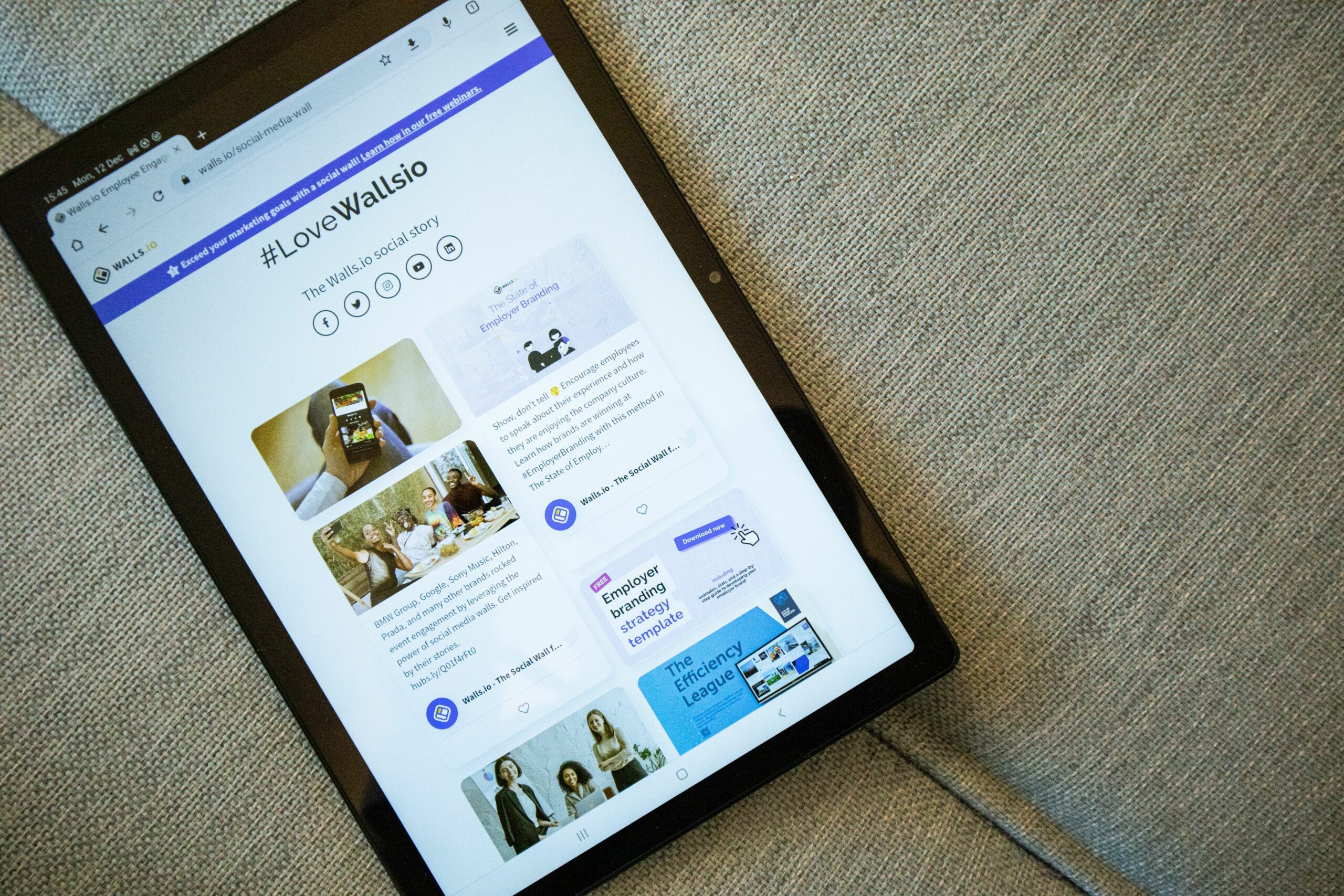
LinkedIn optimizes for speed, which means it will compress images after upload and sometimes generate multiple sizes for different devices. That is why a crisp design in your editor can look soft in the feed, especially if you started from a small file. To protect quality, design at or above the suggested pixel size, then export as PNG for text-heavy graphics and JPG for photos. In addition, avoid ultra-thin fonts and hairline strokes because compression can make them shimmer or break. When you must include text, increase font size, boost contrast, and keep lines thicker than you would for print.
Here is a practical decision rule: if the image contains more than one short sentence, treat it like a slide and use a carousel document instead of a single image. Carousels let users zoom and swipe, so you can keep readability without cramming everything into one frame. For a deeper library of campaign and creative tactics that translate across platforms, browse the InfluencerDB blog guides on social creative and adapt the same template logic to LinkedIn.
One more tip that saves time: build a “safe zone” overlay in your design tool. Make a rectangle inset by about 8 to 10 percent on all sides, and keep logos, faces, and headlines inside it. This single habit prevents most accidental crops across desktop and mobile.
Image sizes for creators and brands – posts, carousels, and thumbnails
Creators often use LinkedIn images for thought leadership, case studies, and product proof. Brands use them for announcements, hiring, and demand generation. The specs are only half the story, though; the other half is choosing the right format for the job. Use a single image when you have one idea and one visual. Use a carousel when you need a narrative sequence, a framework, or a mini report. Use a wide 1.91:1 image when the post is tied to a link and you want the preview to look intentional.
For carousels, treat each page like a mobile screen. Keep one main point per slide, use large type, and include page numbers so people know there is more to swipe. A reliable layout is: headline at top, one chart or example in the middle, and a short takeaway line at the bottom. If you are reporting results, add a final slide with the metric definitions you used so the audience can interpret your claims.
Takeaway checklist for post images:
- Choose 1:1 for general feed performance and template reuse.
- Choose 4:5 for more screen real estate on mobile when visuals matter.
- Choose 1.91:1 when the post is link-led and you control the OG image.
- Keep text minimal on single images – move detail into the caption or a carousel.
Banners are where LinkedIn crops most aggressively, because UI elements sit on top of your design. On personal profiles, the avatar, headline area, and buttons can cover the left and center depending on device. On company pages, the crop can shift between desktop and mobile, which is why tiny taglines often become unreadable. Instead of fighting the layout, design banners with a strong background, one focal element, and a short phrase that still works if the edges are trimmed.
A practical workflow is to export two versions: one “safe” version with all critical elements centered, and one “full” version that uses the edges for texture and secondary details. Upload the safe version if you cannot test across devices. If you can test, preview on at least one iPhone-sized screen and one desktop browser before you finalize. Also, keep file sizes reasonable so the upload is fast, but do not downscale below the recommended pixel size.
Takeaway checklist for banners:
- Use high contrast and large type – banners are viewed quickly.
- Avoid placing faces or logos near the left edge on profile banners.
- Skip dense text – put details in the About section or pinned post instead.
Measurement terms you should define in your brief (so creative and reporting match)
Image specs affect performance, but you still need consistent measurement to know what worked. Define these terms early in your brief so creators, designers, and analysts are aligned:
- Reach – the number of unique people who saw your content.
- Impressions – total views, including repeat views by the same person.
- Engagement rate – engagements divided by impressions or reach (state which). A common formula is: engagement rate = (reactions + comments + shares + clicks) / impressions.
- CPM – cost per thousand impressions. Formula: CPM = (spend / impressions) x 1000.
- CPV – cost per view, usually used for video. Formula: CPV = spend / views.
- CPA – cost per acquisition (lead, signup, purchase). Formula: CPA = spend / conversions.
- Whitelisting – running paid ads through a creator’s account handle (where permitted) to leverage their identity and social proof.
- Usage rights – permission to reuse a creator’s content in other channels (ads, website, email) for a defined time and geography.
- Exclusivity – an agreement that restricts the creator from working with competitors for a period of time.
Example calculation: you spend $1,200 promoting a LinkedIn post that generates 180,000 impressions and 240 leads. Your CPM is (1200 / 180000) x 1000 = $6.67. Your CPA is 1200 / 240 = $5. If your images were soft and your click-through rate lagged, you might see CPM stay stable while CPA rises – a sign the creative is the bottleneck, not delivery.
For official guidance on ad specs and placements, cross-check LinkedIn’s documentation in the LinkedIn Marketing Solutions hub. Keep your internal spec sheet updated quarterly because platforms tweak rendering and placements.
A step-by-step workflow to produce sharp LinkedIn images every time
This workflow is built for teams that ship weekly content and need consistency. It also works for solo creators who want to stop guessing.
- Pick the placement first. Decide whether this is a feed image, carousel, banner, or link preview. Do not start designing until you know the destination.
- Choose one aspect ratio per series. For example, commit to 1080 x 1350 for a month of posts if you want maximum mobile real estate.
- Start from a template at full size. Build in Figma, Canva, or Photoshop using the pixel sizes in the table above.
- Design for mobile readability. If you cannot read it at arm’s length on your phone, it is too small.
- Export with intent. Use PNG for text and UI-like graphics, JPG for photos. Keep sRGB color and avoid extreme compression.
- Run a two-device preview. Check one desktop browser and one phone. Look for cropped corners, covered text, and softened type.
- Log what you shipped. Save the final file name with aspect ratio and date, for example: 2026-09-LinkedIn-1080×1350-slide1.png.
Takeaway: if you implement only steps 1, 4, and 6, your “why is this blurry” problems drop fast. The rest is about speed and repeatability.
Common mistakes that make LinkedIn images look unprofessional
Most issues come from avoidable habits, not bad design taste. First, people design at a random size, then stretch the image to fit, which guarantees softness. Second, they place key text near edges, then LinkedIn crops it on mobile. Third, they use low-contrast text on busy photos, which looks fine in a design tool but fails in the feed. Another frequent mistake is exporting a JPG at very low quality to “keep the file small,” then LinkedIn compresses it again and the artifacts become obvious.
Also watch for inconsistent typography across a carousel. If slide one uses a bold headline and slide two switches to a thin font, the series feels stitched together. Finally, do not rely on screenshots of charts unless you rebuild them at native resolution; screenshots often carry compression and scaling issues that get worse after upload.
- Do not upscale small images.
- Do not put logos in corners.
- Do not use tiny text to fit more words.
- Do not export the same file repeatedly – each save can degrade quality.
Best practices for higher-performing LinkedIn visuals (organic and paid)
Once your specs are correct, performance comes down to clarity and intent. Use one clear focal point per image: a face, a product, a bold number, or a short headline. Keep copy tight and let the caption do the explaining. If you need to teach, use a carousel and structure it like a story: problem, insight, steps, example, takeaway. For paid campaigns, match the visual to the objective: lead gen images should emphasize the outcome, while awareness images can prioritize brand cues and memorability.
When you test creative, change one variable at a time. For example, keep the same caption and swap only the image aspect ratio for a week. Track impressions, clicks, and downstream conversions so you do not optimize for reactions alone. If you are aligning with broader social standards, the W3C accessibility guidance is a useful reference point for contrast and readable text sizing, even though it is not LinkedIn-specific.
Takeaway checklist for best practices:
- Use a consistent template system for series content.
- Keep text large and high-contrast, especially on 4:5.
- Include subtle branding – color, type, or a small mark – without turning the post into an ad.
- Measure beyond engagement: track CPM, CPA, and conversion rate when you have links or lead forms.
Planning table – choose the right format based on your goal
If you are deciding between a single image, a carousel, and a link preview, use the table below as a quick planning tool. It is designed for marketers who need a decision rule, not a debate.
| Goal | Best format | Recommended aspect ratio | Creative tip | Primary metric to watch |
|---|---|---|---|---|
| Thought leadership | Single image or carousel | 1:1 or 4:5 | Lead with one strong claim, then support it in the caption | Engagement rate (define denominator) |
| Education and frameworks | Carousel document | 1:1 or 4:5 | One idea per slide, add a summary slide at the end | Saves, shares, completion behavior |
| Traffic to a resource | Link post with OG image | 1.91:1 | Design OG image like a headline card, not a banner ad | CTR and landing page conversion rate |
| Hiring | Single image + strong caption | 1:1 | Use role title and location in large type, keep details in text | Clicks to job page, qualified applicants |
| Lead generation (paid) | Sponsored content image | 1:1 or 1.91:1 | Show the outcome first, then the offer | CPA and lead quality |
Final takeaway: specs are the baseline, not the strategy. If you standardize your templates, define your metrics, and preview on mobile, your LinkedIn visuals will look sharper and your results will be easier to explain to stakeholders.